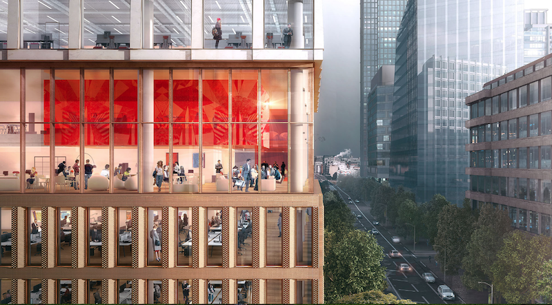
The site for a new 21-story office building, dubbed Friars Bridge Court, from PLP Architecture is unique in terms of the surrounding architecture. The new building will replace an old office building from 1991 at the northern end of Blackfriars Road in the London Borough of Southwark. What makes the site unique, and, ultimately, what will make the building itself unique, is that buildings fairly uniform in height characterize the southern half of Blackfriars Road, but the northern half has a more varied street wall that culminates in a series of object towers near the northern terminus, according to the architect’s website.
In an effort to complement both the southern and northern buildings, the new tower will employ a series of transitional elements into its design. As the firm explains on its website, the building “is designed to strengthen the end of the block in which it sits and announce through its scale the transition to the more singular buildings towards the river.”
The design proposes a “volumetric extrusion” of a height similar to that of the mid-rise buildings nearby. The volume is then split vertically into two volumes. The Western volume is lowered in order to establish a street height with the other buildings adjoining the site. The volume, which has already been divided into two, is then divided further, horizontally across its base this time, to form an upper and lower component. The lower component, which includes the shorter western volume to form an “L” shape, is meant to anchor the building into the immediate context (meaning the uniform, smaller buildings on the south side of the street), while the upper component is to be perceived in the wider townscape setting.
Between the upper and lower volumes will be a large gallery space, providing open views into and out of the building. This gallery space exists at a point that works to strengthen datum lines on the facades of surrounding buildings. A recessed double-height lobby space is added at the ground level.
The building’s form is not the only transitional aspect of the tower. The masonry envelope will also differ between volumes. The lower portion of the building will be clad in a denser grain façade expressed through the use of light-colored brick. The upper volume’s facade will be a light sandstone colored mineral finished grid.
The result of all of these transitional elements is a building that manages to fit in with the smaller buildings immediately surrounding it while also softening the height difference between the southern and northern buildings.
The completed tower will provide 196,800 sf of office space and 7,300 sf of retail space. Additionally, the tower will emphasize flexibility in its office space, something the old building could not provide. Friars Bridge Court will also provide amenity spaces and two roof top terraces.
 Rendering courtesy of PLP Architecture.
Related Stories
Office Buildings | Feb 13, 2020
CareerBuilder’s Chicago HQ undergoes renovation
Perkins and Will designed the project.
Office Buildings | Feb 11, 2020
Want your organization to be more creative? Embrace these 4 workplace strategies
Creativity is the secret sauce in the success of every business.
Office Buildings | Feb 11, 2020
Forget Class A: The opportunity is with Class B and C office properties
There’s money to be made in rehabbing Class B and Class C office buildings, according to a new ULI report.
Office Buildings | Feb 3, 2020
Balancing the work-life balance
For companies experiencing rapid growth, work-life balance can be a challenge to maintain, yet it remains a vital aspect of a healthy work environment.
Sponsored | HVAC | Feb 3, 2020
Reliable Building Systems Increase Net Operating Income by Retaining Tenants
Tenants increasingly expect a well-crafted property that feels unique, authentic, and comfortable—with technologically advanced systems and spaces that optimize performance and encourage collaboration and engagement. The following guidance will help owners and property managers keep tenants happy.
Office Buildings | Jan 29, 2020
Zaha Hadid Architects to build OPPO’s new Shenzhen HQ
ZHA sees your two connected towers and raises you another two.
Wood | Jan 24, 2020
105,000-sf vertical mass timber expansion will cap D.C.’s 80 M Street
Hickok Cole is designing the project.
Office Buildings | Jan 22, 2020
Headspace expands Santa Monica corporate HQ
Montalba Architects designed the project.
Office Buildings | Jan 19, 2020
Internet platform connects its employees with mile-long staircase in new HQ
Color also plays a big role in the interior design of this 19-story building.
Office Buildings | Jan 16, 2020
Jaguar Land Rover’s Advanced Product Creation Centre has the largest timber roof in Europe
Bennetts Associates designed the project.


