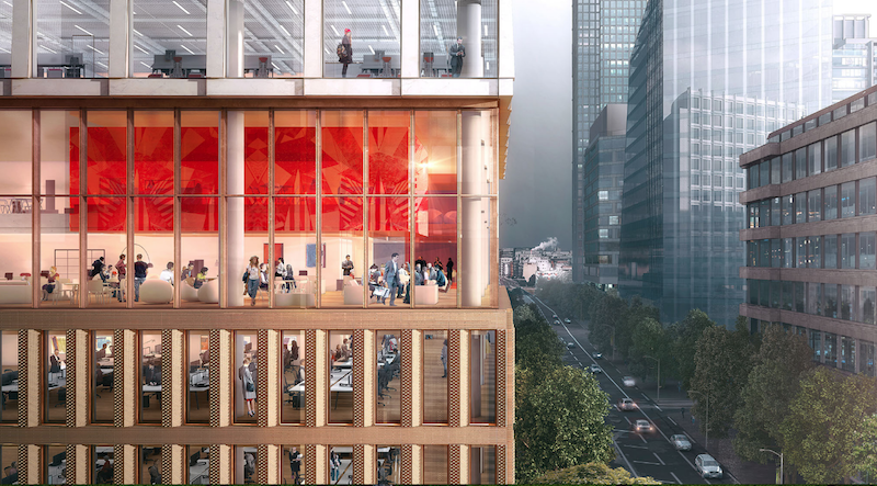
The site for a new 21-story office building, dubbed Friars Bridge Court, from PLP Architecture is unique in terms of the surrounding architecture. The new building will replace an old office building from 1991 at the northern end of Blackfriars Road in the London Borough of Southwark. What makes the site unique, and, ultimately, what will make the building itself unique, is that buildings fairly uniform in height characterize the southern half of Blackfriars Road, but the northern half has a more varied street wall that culminates in a series of object towers near the northern terminus, according to the architect’s website.
In an effort to complement both the southern and northern buildings, the new tower will employ a series of transitional elements into its design. As the firm explains on its website, the building “is designed to strengthen the end of the block in which it sits and announce through its scale the transition to the more singular buildings towards the river.”
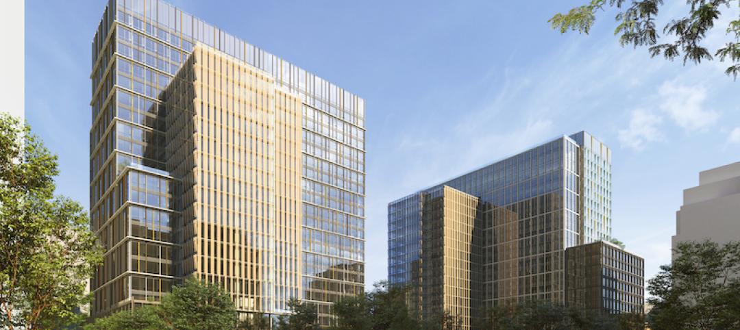
The design proposes a “volumetric extrusion” of a height similar to that of the mid-rise buildings nearby. The volume is then split vertically into two volumes. The Western volume is lowered in order to establish a street height with the other buildings adjoining the site. The volume, which has already been divided into two, is then divided further, horizontally across its base this time, to form an upper and lower component. The lower component, which includes the shorter western volume to form an “L” shape, is meant to anchor the building into the immediate context (meaning the uniform, smaller buildings on the south side of the street), while the upper component is to be perceived in the wider townscape setting.
Between the upper and lower volumes will be a large gallery space, providing open views into and out of the building. This gallery space exists at a point that works to strengthen datum lines on the facades of surrounding buildings. A recessed double-height lobby space is added at the ground level.
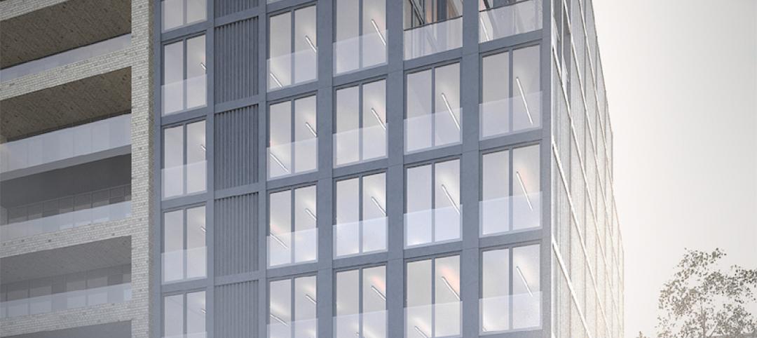
The building’s form is not the only transitional aspect of the tower. The masonry envelope will also differ between volumes. The lower portion of the building will be clad in a denser grain façade expressed through the use of light-colored brick. The upper volume’s facade will be a light sandstone colored mineral finished grid.
The result of all of these transitional elements is a building that manages to fit in with the smaller buildings immediately surrounding it while also softening the height difference between the southern and northern buildings.
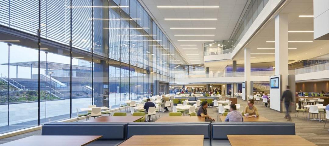
The completed tower will provide 196,800 sf of office space and 7,300 sf of retail space. Additionally, the tower will emphasize flexibility in its office space, something the old building could not provide. Friars Bridge Court will also provide amenity spaces and two roof top terraces.
 Rendering courtesy of PLP Architecture.
Related Stories
Office Buildings | Jul 11, 2019
Designing successful workplaces for an unknown future
The traditional model of signing long-term leases, committing extensive capital to an inflexible solution, and then calling it a day is no longer viable.
Office Buildings | Jul 5, 2019
This will become the tallest shipping container building in the world
Patalab is designing the building.
Design Innovation Report | Jun 25, 2019
2019 Design Innovation Report: Super labs, dream cabins, office boardwalks, façades as art
9 projects that push the limits of architectural design, space planning, and material innovation.
Office Buildings | May 29, 2019
Smart buildings can optimize wellness
Employees want wellness initiatives built into their work experience, especially when they’re in spaces that can leave them feeling stiff, stressed, and sick.
Office Buildings | May 29, 2019
HQ2 in cue: Amazon’s Arlington, Va., headquarters has energy-efficient design
With more than two million sf of LEED-certified office space planned, Amazon's new designs for its second headquarters in Arlington, VA, also will have green space, a one-acre park, and bicycle and public transportation access.
Sustainability | May 28, 2019
Carrier’s world headquarters in Florida goes green
The structure is the first commercial building in Florida to achieve LEED Platinum v4 Certification.
Office Buildings | May 14, 2019
Sail on, Royal Caribbean: HOK-designed headquarters celebrates cruise ship industry
The building’s design is inspired by the design of its fleet of cruise ships—with flowing lines.
Mixed-Use | May 2, 2019
A series of green bridges will connect these two towers in Shenzhen, China
Steven Holl Architects designed the project.
Office Buildings | May 2, 2019
HOK’s latest study takes a new look at tech workplaces
The report provides insight into the relative importance of such things as amenities and occupant health for recruiting and retaining workers.
Office Buildings | Apr 25, 2019
Study: Half of corporate and government offices offer wellness programs
Nearly 30% of worksites offer programs for physical activity and fitness, according to the CDC.


