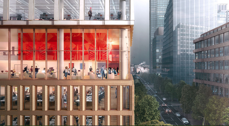
The site for a new 21-story office building, dubbed Friars Bridge Court, from PLP Architecture is unique in terms of the surrounding architecture. The new building will replace an old office building from 1991 at the northern end of Blackfriars Road in the London Borough of Southwark. What makes the site unique, and, ultimately, what will make the building itself unique, is that buildings fairly uniform in height characterize the southern half of Blackfriars Road, but the northern half has a more varied street wall that culminates in a series of object towers near the northern terminus, according to the architect’s website.
In an effort to complement both the southern and northern buildings, the new tower will employ a series of transitional elements into its design. As the firm explains on its website, the building “is designed to strengthen the end of the block in which it sits and announce through its scale the transition to the more singular buildings towards the river.”
The design proposes a “volumetric extrusion” of a height similar to that of the mid-rise buildings nearby. The volume is then split vertically into two volumes. The Western volume is lowered in order to establish a street height with the other buildings adjoining the site. The volume, which has already been divided into two, is then divided further, horizontally across its base this time, to form an upper and lower component. The lower component, which includes the shorter western volume to form an “L” shape, is meant to anchor the building into the immediate context (meaning the uniform, smaller buildings on the south side of the street), while the upper component is to be perceived in the wider townscape setting.
Between the upper and lower volumes will be a large gallery space, providing open views into and out of the building. This gallery space exists at a point that works to strengthen datum lines on the facades of surrounding buildings. A recessed double-height lobby space is added at the ground level.
The building’s form is not the only transitional aspect of the tower. The masonry envelope will also differ between volumes. The lower portion of the building will be clad in a denser grain façade expressed through the use of light-colored brick. The upper volume’s facade will be a light sandstone colored mineral finished grid.
The result of all of these transitional elements is a building that manages to fit in with the smaller buildings immediately surrounding it while also softening the height difference between the southern and northern buildings.
The completed tower will provide 196,800 sf of office space and 7,300 sf of retail space. Additionally, the tower will emphasize flexibility in its office space, something the old building could not provide. Friars Bridge Court will also provide amenity spaces and two roof top terraces.
 Rendering courtesy of PLP Architecture.
Related Stories
Office Buildings | Apr 8, 2019
It’s time for office amenities to get to work
Amenities with the greatest impact on effectiveness and experience are those that directly support the work needs of individual employees and their teams.
Office Buildings | Apr 8, 2019
Denver office building features 13,000 sf green roof
Dynia Architects designed the building.
Office Buildings | Apr 5, 2019
2019 trends in the workplace
From retention and career advancement to the ethics of inclusion and diversity, these five trends will play a major role this year in design, strategic planning and workplace development.
Industrial Facilities | Mar 10, 2019
The burgeoning Port San Antonio lays out growth plans
Expansions would accommodate cybersecurity, aerospace, and defense tenants, and help commercialize technologies.
Office Buildings | Mar 6, 2019
How to leverage design and culture’s two-way relationship for better workplaces
The relationship between workplace design and company culture isn’t all that different from a tango.
Office Buildings | Feb 15, 2019
A healthier perspective: Office developers bet on wellness amenities to attract top-notch tenants
Owners and developers are driving demand for wellness features and practices—active stairways, biophilia, enhanced air quality, etc.—as one more way draw tenants.
Office Buildings | Feb 15, 2019
Vancouver’s new office building will be a stack of reflective boxes
OSO and Merrick Architecture designed the building.
Office Buildings | Feb 11, 2019
Real-world wellness pays off
3form, a materials manufacturer, did a top-to-bottom remodel of its Salt Lake City headquarters campus that included adding a 14,500-sf gym.
Office Buildings | Feb 5, 2019
Duluth Trading Company moves to new HQ building
Plunkett Raysich Architects designed the project.
Interior Architecture | Jan 14, 2019
To get more involved earlier in projects, a leading furniture dealer launches a firm for commercial interiors construction
Vantis is positioned to integrate design with offsite customized fabrication.


