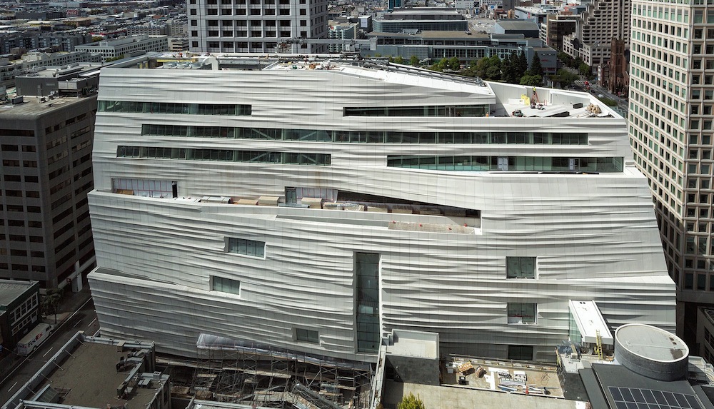
To call to mind the waters of the bay, the renovated San Francisco Museum of Modern Art (SFMOMA) uses more than 700 uniquely shaped fiberglass reinforced polymer (FRP) panels on its exterior, resulting in a tall, white, and wavy building. To really capture the eye, silicate crystals have been embedded to reflect changing light.
The architecture firm Snøhetta designed a 10-story expansion to the SFMOMA. Along with the new façade, the museum will have 170,000 sf of new and renovated indoor and outdoor gallery space, which triples the previous amount. The galleries are intimate, flexible, and column-free, giving artists more freedom with which to work.
The building has two main entrances, an education center, two restaurants, a coffee shop, a light-filled atrium, a third floor terrace with a public living wall with more than 19,000 plants, and a renovated Phyllis Wattis Theater, which now has a 4K projection screen.
“Our design seeks to create an intimate experience, welcoming a diversity of visitors to the magnificent collection, and fostering a connection between the visitor and museum for years to come,” Craig Dykers, founding partner of Snøhetta and leader of the design team for SFMOMA, said in a statement. “All of the senses will be engaged as part of the experience. Wonderful day lit staircases lead visitors from floor to floor, the galleries create a comfortable viewing experience of the art, and terraces allow for moments of repose, to be reinvigorated by fresh air, sunlight and vistas of the city between galleries. The visitor should sense that the building is inspired by one of the great cities of the world, San Francisco.”
Interactive touch screens have been installed in the painting and sculpture galleries, and a new app gives visitors a guided audio tour through both the museum and the surrounding SoMa neighborhood.
The museum opens May 14. More than $610 million was raised for the project, which has covered construction costs, the endowment, and support for education, art commissioning and exhibition programs.
SFMOMA contains 33,000 works of architecture and design, painting, photography and sculpture. It also has the Doris and Donald Fisher Collection, a private collection of contemporary art featuring pieces by Andy Warhol, Roy Lichtenstein, and Tony Cragg.
The museum was established in 1935. Swiss architect Mario Botta designed the museum’s current building, which opened in 1995. The Snøhetta expansion will be added onto it.
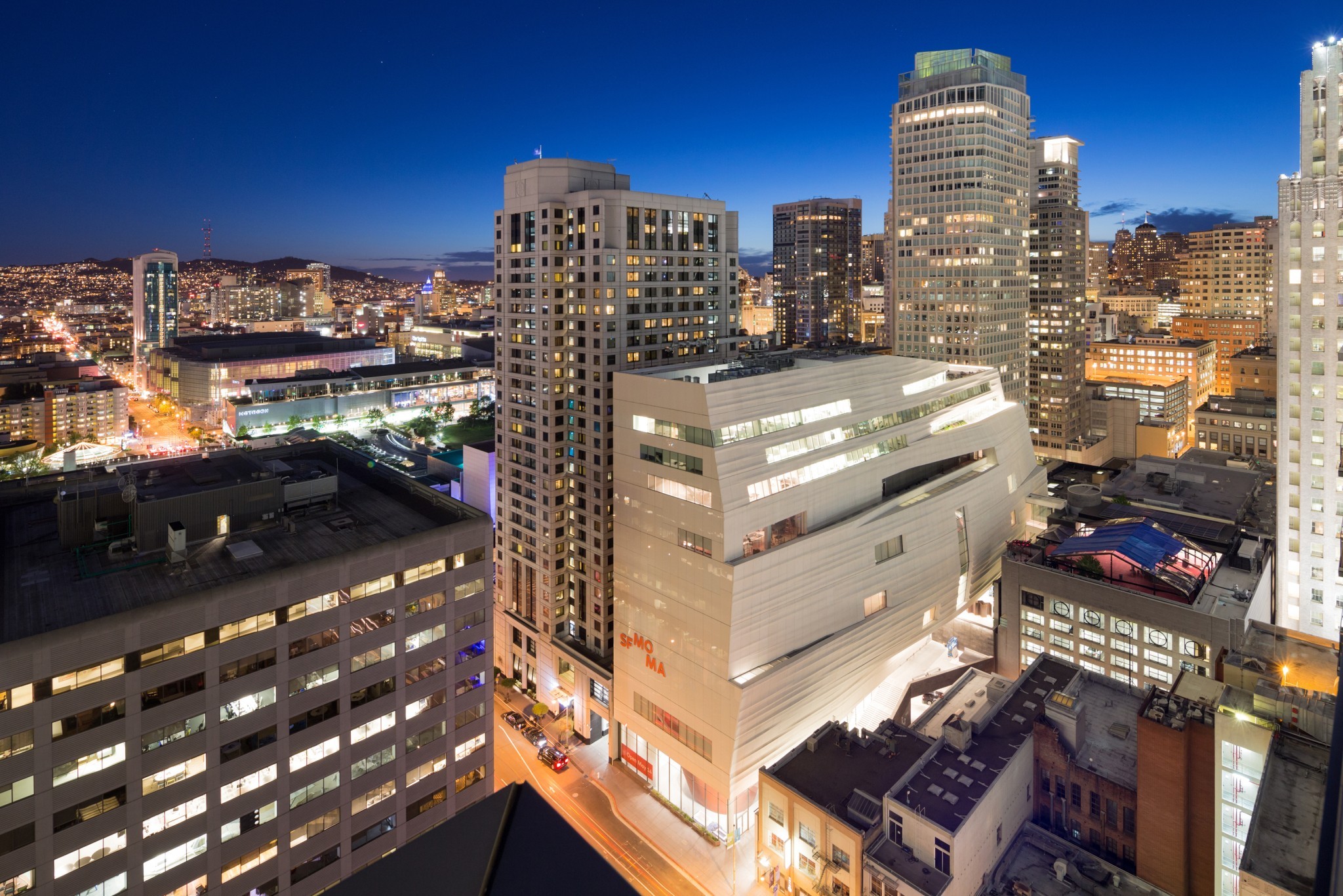 SFMOMA. Photo: Henrik Kam, courtesy SFMOMA. Click image to enlarge.
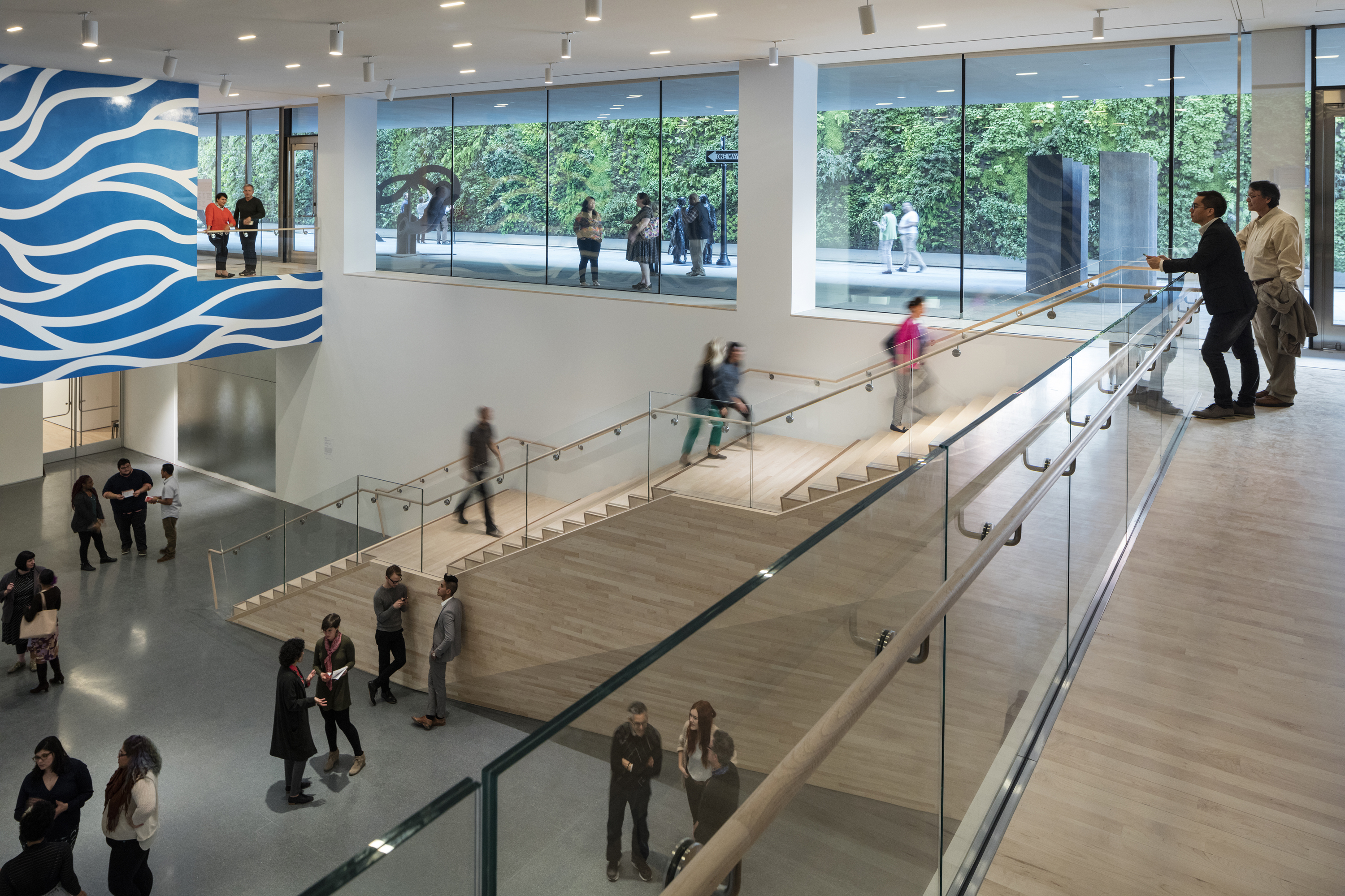 Helen and Charles Schwab Hall. Photo: Henrik Kam, courtesy SFMOMA. Click image to enlarge.
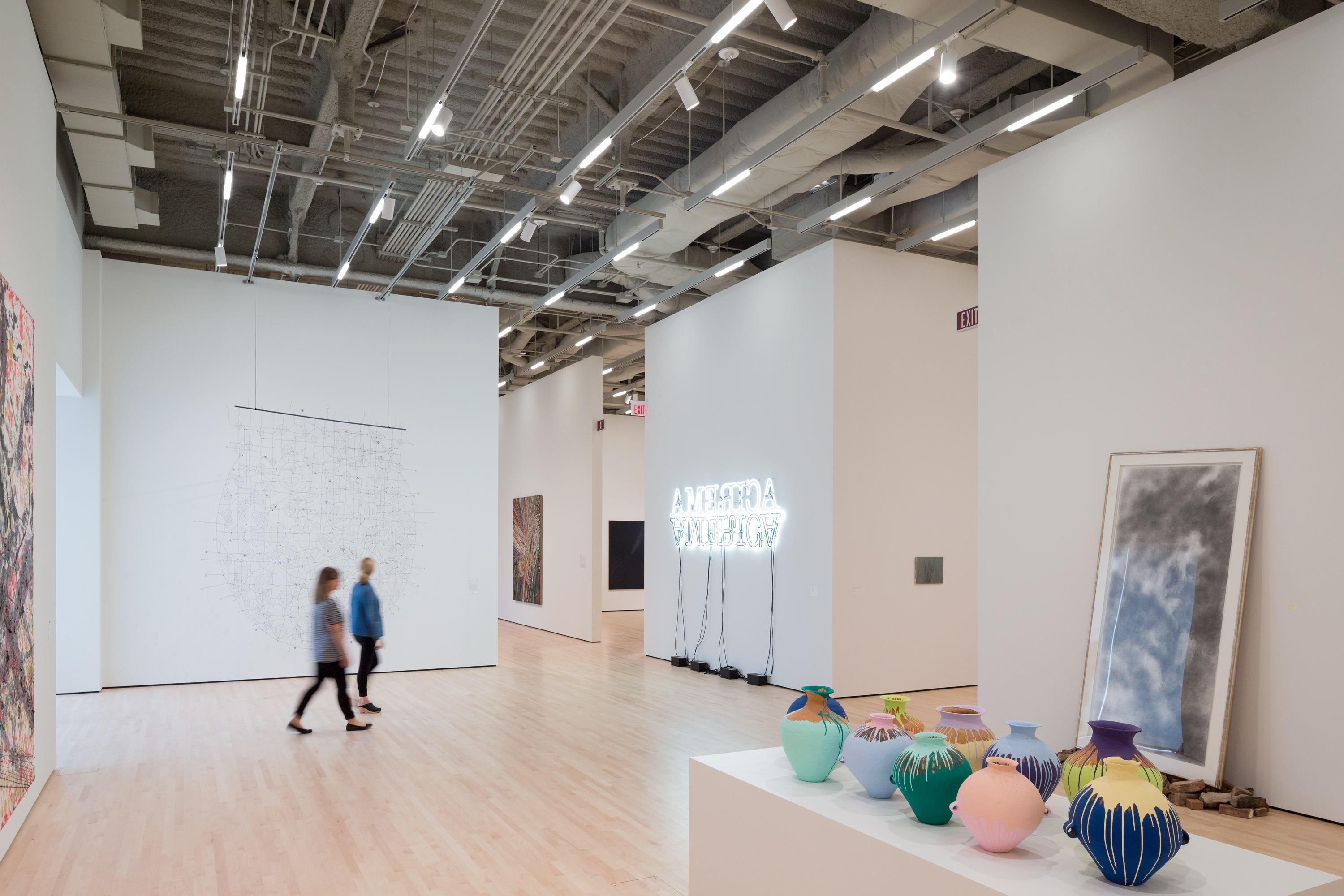 The Campaign for Art Contemporary exhibition. Photo: Iwan Baan, courtesy SFMOMA. Click image to enlarge.
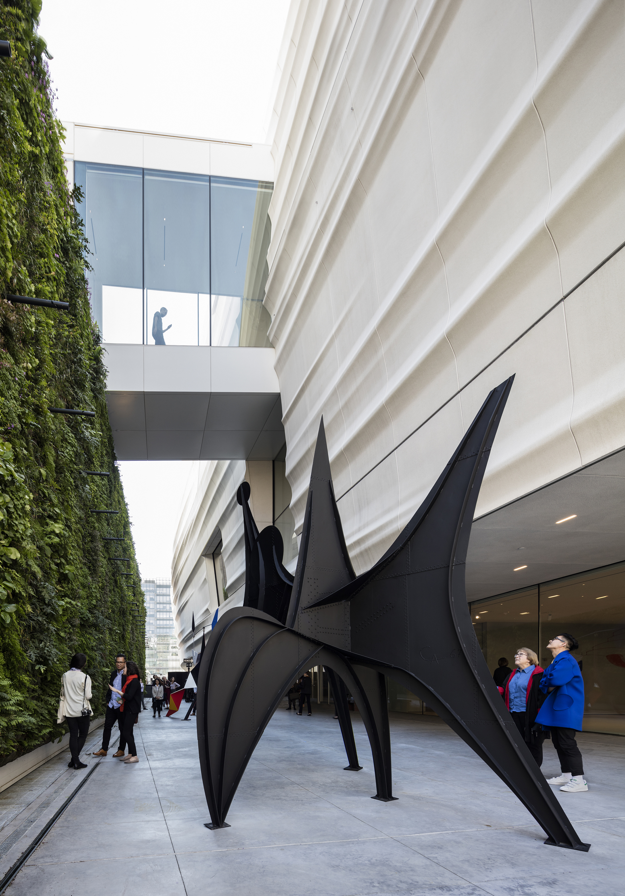 The exterior cladding and the living wall at the Pat and Bill Wilson Sculpture Terrace. Photo: Henrik Kam, courtesy SFMOMA. Click image to enlarge.
Related Stories
| Mar 13, 2014
Do you really 'always turn right'?
The first visitor center we designed was the Ernest F. Coe Visitor Center for the Everglades National Park in 1993. I remember it well for a variety of reasons, not the least of which was the ongoing dialogue we had with our retail consultant. He insisted that the gift shop be located on the right as one exited the visitor center because people “always turn right.”
| Mar 12, 2014
14 new ideas for doors and door hardware
From a high-tech classroom lockdown system to an impact-resistant wide-stile door line, BD+C editors present a collection of door and door hardware innovations.
| Mar 5, 2014
5 tile design trends for 2014
Beveled, geometric, and high-tech patterns are among the hot ceramic tile trends, say tile design experts.
| Feb 24, 2014
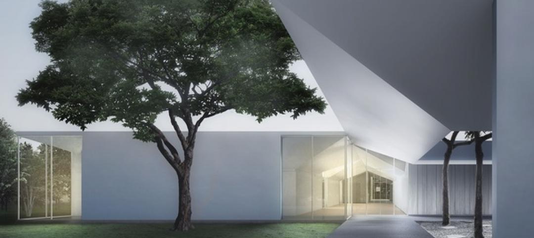
New Menil Drawing Institute will fit in with leafy surroundings
In Houston, plans are being finalized for the first freestanding American building built to house and conserve modern and contemporary drawings.
| Feb 18, 2014
Robert A.M. Stern sent back to drawing board for Revolutionary War museum in Philadelphia
The Philadelphia Art Commission has suggested some significant changes to the design by Robert A.M. Stern Architects, namely the elimination of a cupola and the addition of eye-level windows on the ground floor.
| Feb 14, 2014
Giant interactive pinwheel adds fun to museum exterior
The proposed design for the Santa Cruz Museum of Art and History features a 10-foot pinwheel that can be activated by passersby.
| Feb 14, 2014
Crowdsourced Placemaking: How people will help shape architecture
The rise of mobile devices and social media, coupled with the use of advanced survey tools and interactive mapping apps, has created a powerful conduit through which Building Teams can capture real-time data on the public. For the first time, the masses can have a real say in how the built environment around them is formed—that is, if Building Teams are willing to listen.
| Feb 13, 2014
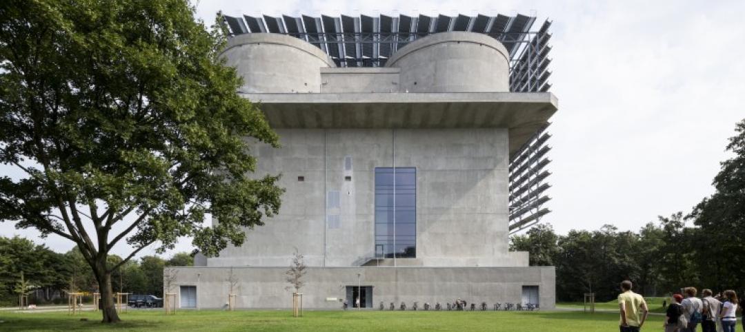
Extreme Conversion: Nazi bunker transformed into green power plant, war memorial
The bunker, which sat empty for over 60 years after WWII, now uses sustainable technology and will provide power to about 4,000 homes.
| Jan 30, 2014
How reverse engineering nature can spur design innovation
It’s not enough to copy nature. Today’s designers need a deeper understanding of environmental nuance, from the biome in.
| Jan 28, 2014
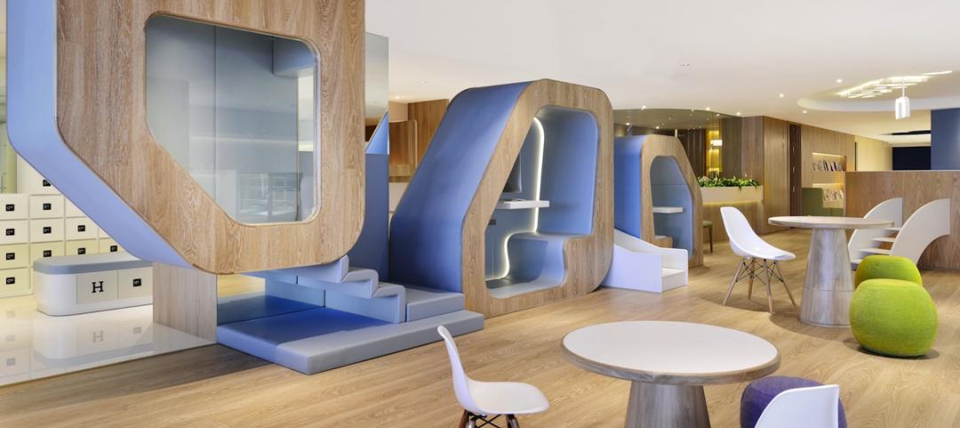
16 awe-inspiring interior designs from around the world [slideshow]
The International Interior Design Association released the winners of its 4th Annual Global Excellence Awards. Here's a recap of the winning projects.


