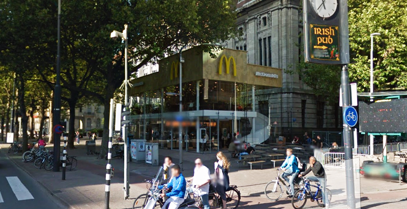
Since the 1960s, residents of the Dutch city of Rotterdam have been bugged by an unsightly cigar shop on Coolsingel, one of its busiest streets.
Years passed, and the eyesore welcomed a new tenant, the U.S.-based fast food chain McDonald’s.
For 45 years, the branch continued to operate in the dated building until finally it received a much needed facelift earlier this year, designed by Mei Architects.
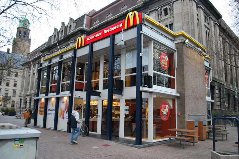 The original building
According to Dezeen, the original glass building, attached to a much older post office, was voted by Rotterdam’s residents as the ugliest structure in the city, and local officials were ready to demolish it. But McDonald’s still had 40 more years on the lease—the redesign route was taken instead.
"Since the 1970s the McDonald's pavilion has been altered frequently. Its quality suffered as a result, with its mostly closed facades. This makes the space anonymous. We want to activate this space again," the design studio’s founder, Robert Winkel, told Dezeen.
The resulting structure is a rectangular glass building with a perforated golden façade, and sleek, white grand spiral staircase. Etched to the façade is pixelated imagery of a crowd, responding to the restaurant’s bustling site. The new building was also detached from the post-office, making it seem more like a pavilion.
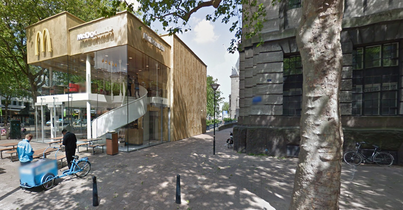 The building is now separated from the much older post office edifice, making the restaurant more like a pavilion. The golden perforated panels depict a pixelated image of a crowd.
Transparency was a key concept in the design. The color-to-ceiling window idea from the original building was kept.
"The transparency and openness, as well as the depicted crowd on the facade panels, emphasize that McDonald's is for everyone, for every Rotterdam resident," Mei Architects' Marloes Koster tells AdFreak.
Onlookers can glimpse into the kitchen as well as get a hint of the grand staircase. By day it reflects sunlight, and the building maintains its glow when sun falls.
"As McDonald's is open day and night, 24/7, its appearance after dark is important," the team told Dezeen. "By day the building is inviting to shoppers, while in the evening it glows to attract the nightlife crowd."
AdWeek reports that the building won an Iconic Award 2015 prize for excellence in architecture and design.
Related Stories
| Oct 7, 2013
10 award-winning metal building projects
The FDNY Fireboat Firehouse in New York and the Cirrus Logic Building in Austin, Texas, are among nine projects named winners of the 2013 Chairman’s Award by the Metal Construction Association for outstanding design and construction.
| Oct 7, 2013
Reimagining the metal shipping container
With origins tracing back to the mid-1950s, the modern metal shipping container continues to serve as a secure, practical vessel for transporting valuable materials. However, these reusable steel boxes have recently garnered considerable attention from architects and constructors as attractive building materials.
| Oct 4, 2013
Mack Urban, AECOM acquire six acres for development in LA's South Park district
Mack Urban and AECOM Capital, the investment fund of AECOM Technology Corporation (NYSE: ACM), have acquired six acres of land in downtown Los Angeles’ South Park district located in the central business district (CBD).
| Sep 24, 2013
8 grand green roofs (and walls)
A dramatic interior green wall at Drexel University and a massive, 4.4-acre vegetated roof at the Kauffman Performing Arts Center in Kansas City are among the projects honored in the 2013 Green Roof and Wall Awards of Excellence.
| Sep 23, 2013
Six-acre Essex Crossing development set to transform vacant New York property
A six-acre parcel on the Lower East Side of New York City, vacant since tenements were torn down in 1967, will be the site of the new Essex Crossing mixed-use development. The product of a compromise between Mayor Michael Bloomberg and various interested community groups, the complex will include ~1,000 apartments.
| Sep 19, 2013
What we can learn from the world’s greenest buildings
Renowned green building author, Jerry Yudelson, offers five valuable lessons for designers, contractors, and building owners, based on a study of 55 high-performance projects from around the world.
| Sep 19, 2013
6 emerging energy-management glazing technologies
Phase-change materials, electrochromic glass, and building-integrated PVs are among the breakthrough glazing technologies that are taking energy performance to a new level.
| Sep 19, 2013
Roof renovation tips: Making the choice between overlayment and tear-off
When embarking upon a roofing renovation project, one of the first decisions for the Building Team is whether to tear off and replace the existing roof or to overlay the new roof right on top of the old one. Roofing experts offer guidance on making this assessment.
| Sep 17, 2013
World's first 'invisible' tower planned in South Korea
The 1,476-foot-tall structure will showcase Korean cloaking technology that utilizes an LED façade fitted with optical cameras that will display the landscape directly behind the building, thus making it invisible.
| Sep 16, 2013
Study analyzes effectiveness of reflective ceilings
Engineers at Brinjac quantify the illuminance and energy consumption levels achieved by increasing the ceiling’s light reflectance.


