Since the 1960s, residents of the Dutch city of Rotterdam have been bugged by an unsightly cigar shop on Coolsingel, one of its busiest streets.
Years passed, and the eyesore welcomed a new tenant, the U.S.-based fast food chain McDonald’s.
For 45 years, the branch continued to operate in the dated building until finally it received a much needed facelift earlier this year, designed by Mei Architects.
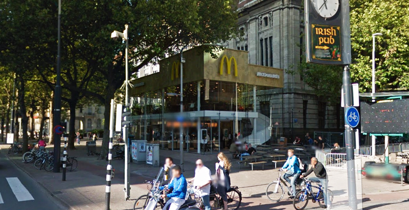
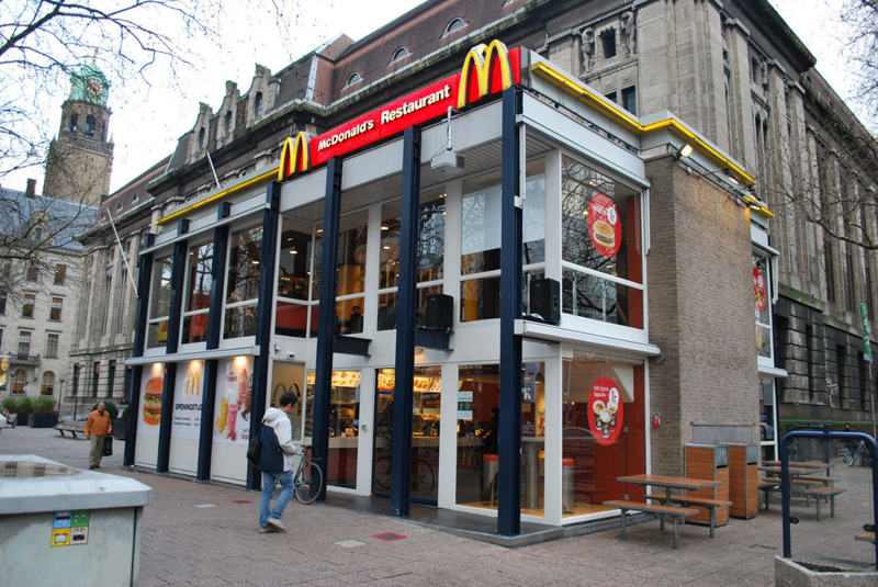 The original building
According to Dezeen, the original glass building, attached to a much older post office, was voted by Rotterdam’s residents as the ugliest structure in the city, and local officials were ready to demolish it. But McDonald’s still had 40 more years on the lease—the redesign route was taken instead.
"Since the 1970s the McDonald's pavilion has been altered frequently. Its quality suffered as a result, with its mostly closed facades. This makes the space anonymous. We want to activate this space again," the design studio’s founder, Robert Winkel, told Dezeen.
The resulting structure is a rectangular glass building with a perforated golden façade, and sleek, white grand spiral staircase. Etched to the façade is pixelated imagery of a crowd, responding to the restaurant’s bustling site. The new building was also detached from the post-office, making it seem more like a pavilion.
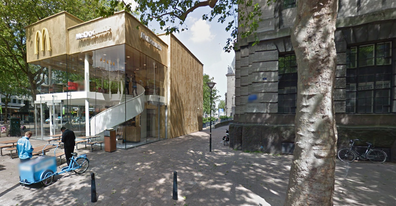 The building is now separated from the much older post office edifice, making the restaurant more like a pavilion. The golden perforated panels depict a pixelated image of a crowd.
Transparency was a key concept in the design. The color-to-ceiling window idea from the original building was kept.
"The transparency and openness, as well as the depicted crowd on the facade panels, emphasize that McDonald's is for everyone, for every Rotterdam resident," Mei Architects' Marloes Koster tells AdFreak.
Onlookers can glimpse into the kitchen as well as get a hint of the grand staircase. By day it reflects sunlight, and the building maintains its glow when sun falls.
"As McDonald's is open day and night, 24/7, its appearance after dark is important," the team told Dezeen. "By day the building is inviting to shoppers, while in the evening it glows to attract the nightlife crowd."
AdWeek reports that the building won an Iconic Award 2015 prize for excellence in architecture and design.
Related Stories
| Feb 10, 2014
Architecture Design Collaborative announces firm opening in Southern California
Today, Architecture Design Collaborative officially announces the launch of its firm providing a full range of architecture and interior design services nationwide. Architecture Design Collaborative offers architectural design services, comprehensive interior design services, developer collaboration, direct tenant improvement, repositioning and site planning.
| Feb 5, 2014
7 towers that define the 'skinny skyscraper' boom [slideshow]
Recent advancements in structural design, combined with the loosening of density and zoning requirements, has opened the door for the so-called "superslim skyscraper."
| Jan 31, 2014
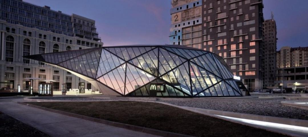
Ultra-modern McDonald's restaurant voted one of world's best new buildings
This McDonald's, which is combined with a fuel station and recreation areas, was awarded the Best Commercial Building of the Year by architecture website ArchDaily.
| Jan 29, 2014
Richard Meier unveils 'urban courtyard' scheme for Mexico City towers
A grand atrium, reaching some 30 stories, highlights the contemporary, bright-white design scheme unveiled this week by Richard Meier & Partners for a new mixed-use development in Mexico City.
| Jan 29, 2014
Hotel, retail, recreation sectors to lead growth in 2014
AIA's Consensus Construction Forecast, a survey of the nation’s leading construction forecasters, is projecting that spending will see a 5.8% increase in 2014, led by the hotel, retail, and amusement/recreation sectors.
| Jan 28, 2014
2014 predictions for skyscraper construction: More twisting towers, mega-tall projects, and 'superslim' designs
Experts from the Council on Tall Buildings and Urban Habitat release their 2014 construction forecast for the worldwide high-rise industry.
| Jan 28, 2014
16 awe-inspiring interior designs from around the world [slideshow]
The International Interior Design Association released the winners of its 4th Annual Global Excellence Awards. Here's a recap of the winning projects.
| Jan 21, 2014
Comcast to build second Philadelphia skyscraper, with Norman Foster-designed tower [slideshow]
The British architect last week unveiled his scheme for the $1.2 billion, 59-story Comcast Innovation and Technology Center, planned adjacent to the Comcast Center.
| Jan 21, 2014
2013: The year of the super-tall skyscraper
Last year was the second-busiest ever in terms of 200-meter-plus building completions, with 73 towers, according to a report by the Council on Tall Buildings and Urban Habitat.
| Jan 13, 2014
Custom exterior fabricator A. Zahner unveils free façade design software for architects
The web-based tool uses the company's factory floor like "a massive rapid prototype machine,” allowing designers to manipulate designs on the fly based on cost and other factors, according to CEO/President Bill Zahner.


