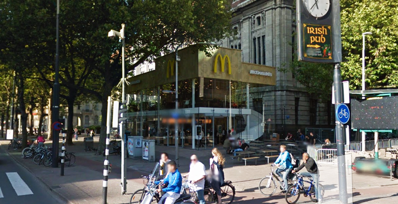
Since the 1960s, residents of the Dutch city of Rotterdam have been bugged by an unsightly cigar shop on Coolsingel, one of its busiest streets.
Years passed, and the eyesore welcomed a new tenant, the U.S.-based fast food chain McDonald’s.
For 45 years, the branch continued to operate in the dated building until finally it received a much needed facelift earlier this year, designed by Mei Architects.
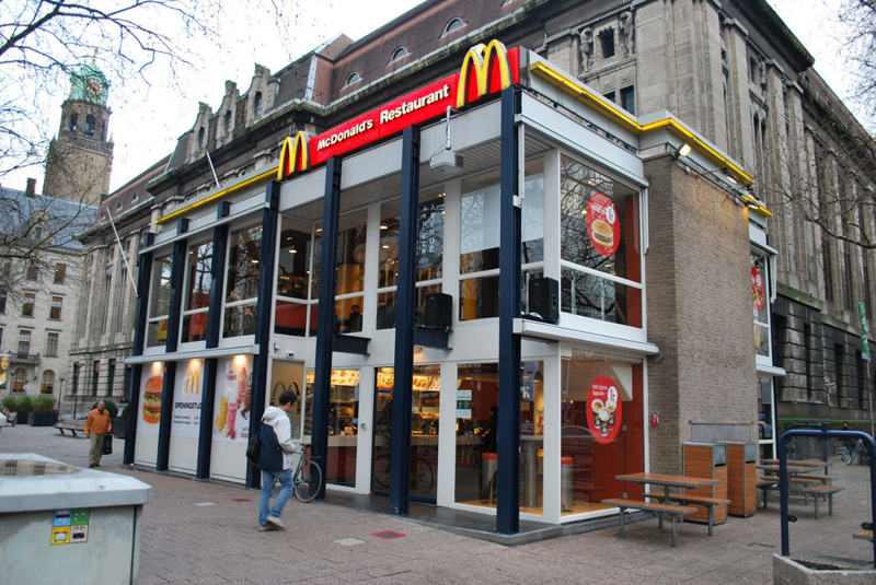 The original building
According to Dezeen, the original glass building, attached to a much older post office, was voted by Rotterdam’s residents as the ugliest structure in the city, and local officials were ready to demolish it. But McDonald’s still had 40 more years on the lease—the redesign route was taken instead.
"Since the 1970s the McDonald's pavilion has been altered frequently. Its quality suffered as a result, with its mostly closed facades. This makes the space anonymous. We want to activate this space again," the design studio’s founder, Robert Winkel, told Dezeen.
The resulting structure is a rectangular glass building with a perforated golden façade, and sleek, white grand spiral staircase. Etched to the façade is pixelated imagery of a crowd, responding to the restaurant’s bustling site. The new building was also detached from the post-office, making it seem more like a pavilion.
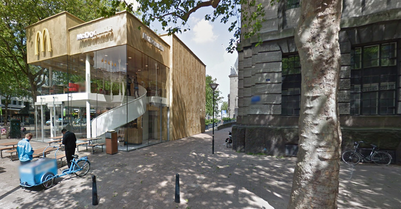 The building is now separated from the much older post office edifice, making the restaurant more like a pavilion. The golden perforated panels depict a pixelated image of a crowd.
Transparency was a key concept in the design. The color-to-ceiling window idea from the original building was kept.
"The transparency and openness, as well as the depicted crowd on the facade panels, emphasize that McDonald's is for everyone, for every Rotterdam resident," Mei Architects' Marloes Koster tells AdFreak.
Onlookers can glimpse into the kitchen as well as get a hint of the grand staircase. By day it reflects sunlight, and the building maintains its glow when sun falls.
"As McDonald's is open day and night, 24/7, its appearance after dark is important," the team told Dezeen. "By day the building is inviting to shoppers, while in the evening it glows to attract the nightlife crowd."
AdWeek reports that the building won an Iconic Award 2015 prize for excellence in architecture and design.
Related Stories
| Jun 30, 2014
4 design concepts that remake the urban farmer's market
The American Institute of Architects held a competition to solve the farmer's markets' biggest design dilemma: lightweight, bland canopies that although convenient, does not protect much from the elements.
| Jun 20, 2014
Sterling Bay pulled on board for Chicago Old Main Post Office project
Sterling Bay Cos. and Bill Davies' International Property Developers North America partner up for a $500 million restoration of Chicago's Old Main Post Office
| Jun 19, 2014
First look: JDS Architects' roller-coaster-like design for Istanbul waterfront development
The development's wavy and groovy design promises unobstructed views of the Marmara Sea for every unit.
| Jun 18, 2014
Study shows walkable urbanism has positive economic impact
Walkable communities have a higher GDP, greater wealth, and higher percentages of college grads, according to a new study by George Washington University.
| Jun 18, 2014
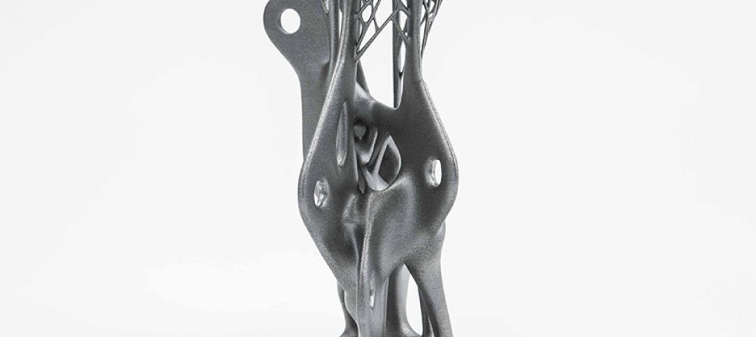
Arup uses 3D printing to fabricate one-of-a-kind structural steel components
The firm's research shows that 3D printing has the potential to reduce costs, cut waste, and slash the carbon footprint of the construction sector.
| Jun 16, 2014
6 U.S. cities at the forefront of innovation districts
A new Brookings Institution study records the emergence of “competitive places that are also cool spaces.”
| Jun 13, 2014
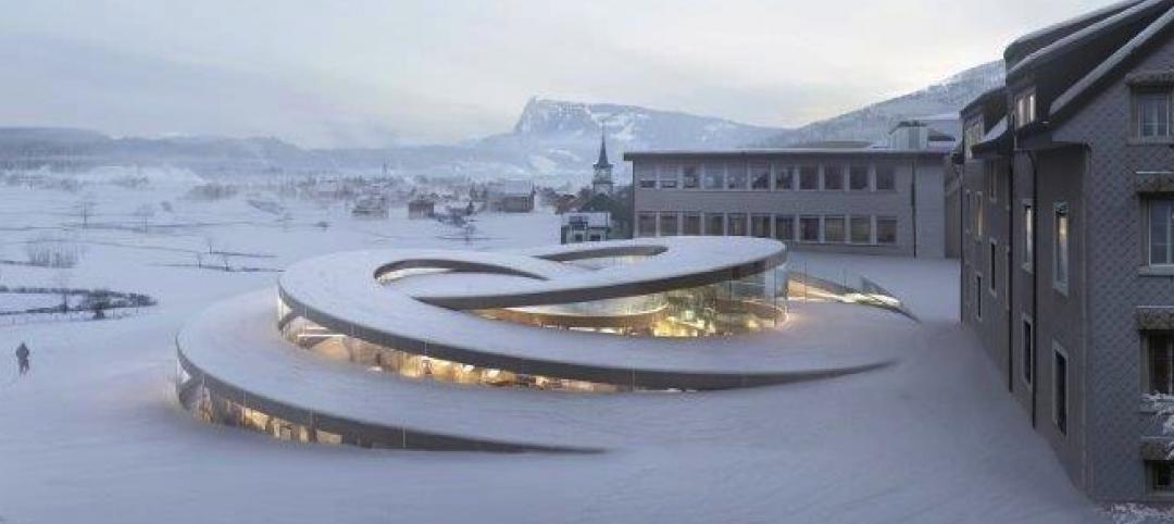
First look: BIG's spiraling museum for watchmaker Audemars Piguet
The glass-and-steel pavilion's spiral structure acts as a storytelling device for the company's history.
| Jun 12, 2014
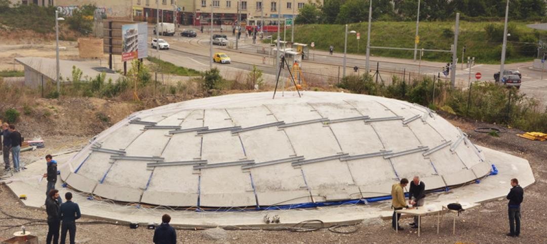
Austrian university develops 'inflatable' concrete dome method
Constructing a concrete dome is a costly process, but this may change soon. A team from the Vienna University of Technology has developed a method that allows concrete domes to form with the use of air and steel cables instead of expensive, timber supporting structures.
| Jun 11, 2014
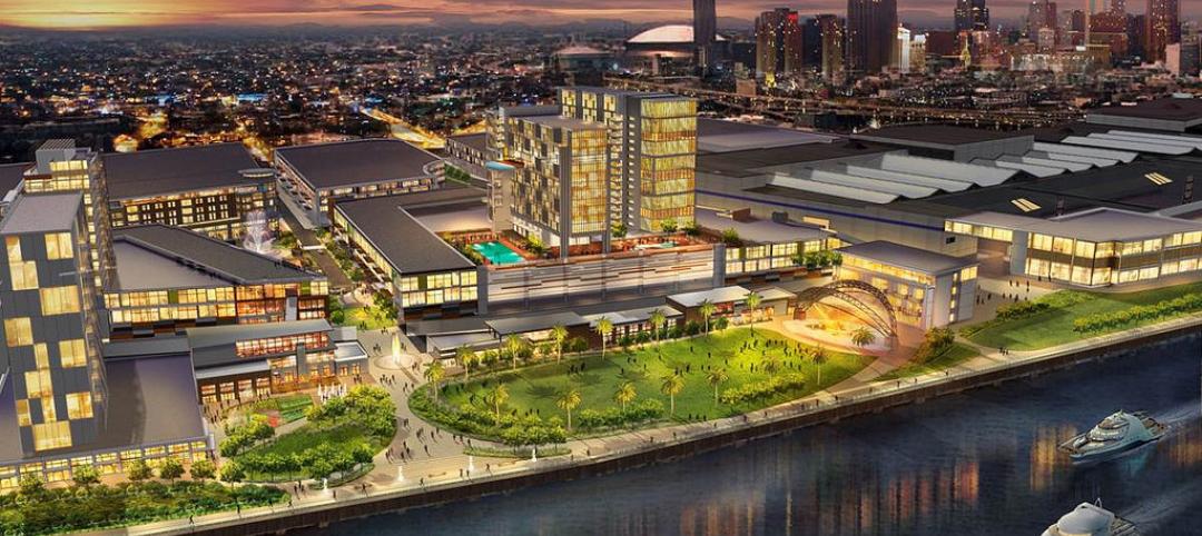
Bill signing signals approval to revitalize New Orleans’ convention center corridor
A plan to revitalize New Orleans' Convention Center moves forward after Louisiana governor signs bill.
| Jun 9, 2014
Green Building Initiative launches Green Globes for Sustainable Interiors program
The new program focuses exclusively on the sustainable design and construction of interior spaces in nonresidential buildings and can be pursued by both building owners and individual lessees of commercial spaces.


