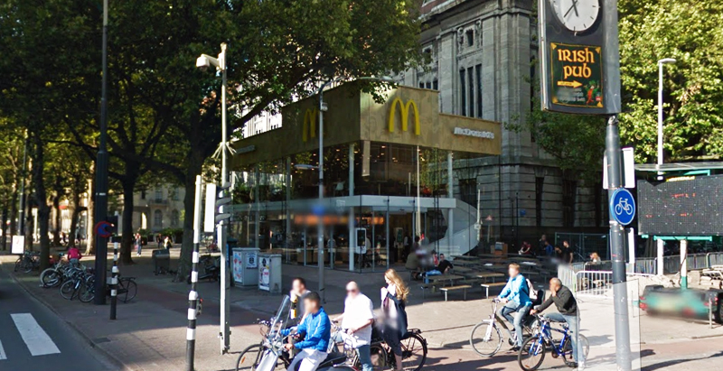
Since the 1960s, residents of the Dutch city of Rotterdam have been bugged by an unsightly cigar shop on Coolsingel, one of its busiest streets.
Years passed, and the eyesore welcomed a new tenant, the U.S.-based fast food chain McDonald’s.
For 45 years, the branch continued to operate in the dated building until finally it received a much needed facelift earlier this year, designed by Mei Architects.
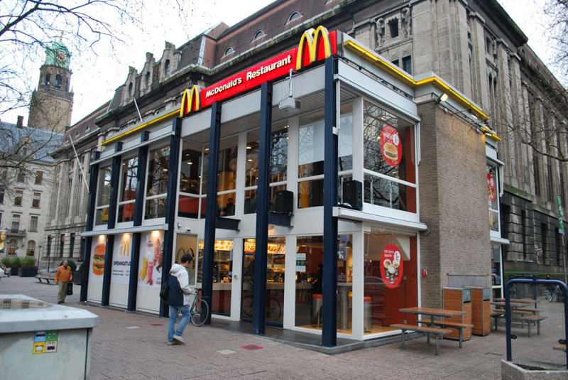 The original building
According to Dezeen, the original glass building, attached to a much older post office, was voted by Rotterdam’s residents as the ugliest structure in the city, and local officials were ready to demolish it. But McDonald’s still had 40 more years on the lease—the redesign route was taken instead.
"Since the 1970s the McDonald's pavilion has been altered frequently. Its quality suffered as a result, with its mostly closed facades. This makes the space anonymous. We want to activate this space again," the design studio’s founder, Robert Winkel, told Dezeen.
The resulting structure is a rectangular glass building with a perforated golden façade, and sleek, white grand spiral staircase. Etched to the façade is pixelated imagery of a crowd, responding to the restaurant’s bustling site. The new building was also detached from the post-office, making it seem more like a pavilion.
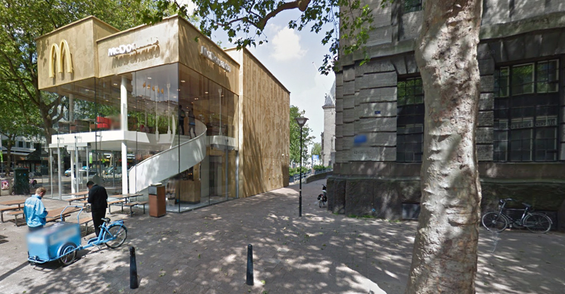 The building is now separated from the much older post office edifice, making the restaurant more like a pavilion. The golden perforated panels depict a pixelated image of a crowd.
Transparency was a key concept in the design. The color-to-ceiling window idea from the original building was kept.
"The transparency and openness, as well as the depicted crowd on the facade panels, emphasize that McDonald's is for everyone, for every Rotterdam resident," Mei Architects' Marloes Koster tells AdFreak.
Onlookers can glimpse into the kitchen as well as get a hint of the grand staircase. By day it reflects sunlight, and the building maintains its glow when sun falls.
"As McDonald's is open day and night, 24/7, its appearance after dark is important," the team told Dezeen. "By day the building is inviting to shoppers, while in the evening it glows to attract the nightlife crowd."
AdWeek reports that the building won an Iconic Award 2015 prize for excellence in architecture and design.
Related Stories
| Sep 3, 2014
New designation launched to streamline LEED review process
The LEED Proven Provider designation is designed to minimize the need for additional work during the project review process.
| Sep 2, 2014
Ranked: Top green building sector AEC firms [2014 Giants 300 Report]
AECOM, Gensler, and Turner top BD+C's rankings of the nation's largest green design and construction firms.
| Aug 21, 2014
RTKL's parent company Arcadis acquires Callison
The acquisition of Callison, known predominantly for its leadership in retail and mixed-use design, builds on Arcadis’ strong global design and architecture position, currently provided by RTKL.
| Aug 19, 2014
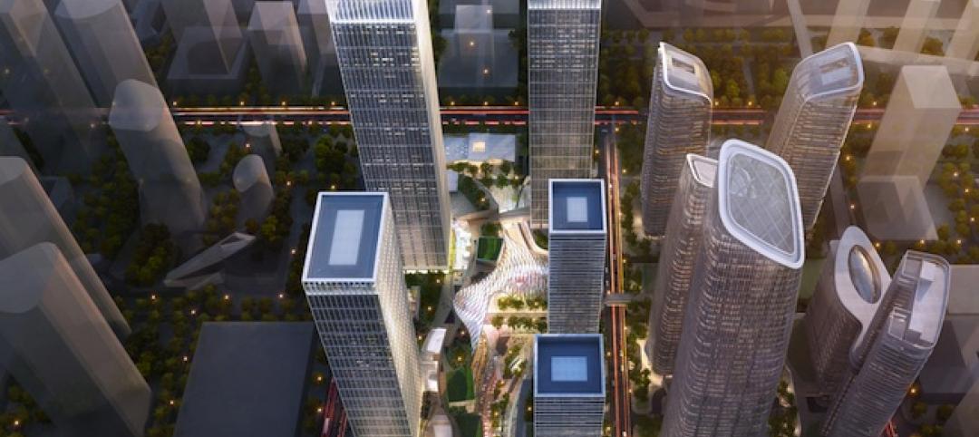
Goettsch Partners unveils design for mega mixed-use development in Shenzhen [slideshow]
The overall design concept is of a complex of textured buildings that would differentiate from the surrounding blue-glass buildings of Shenzhen.
| Aug 18, 2014
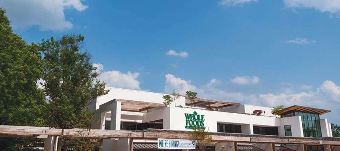
From icon to breadbasket: Gehry building to be turned into Whole Foods
The Howard Hughes Corporation, in association with architecture firm Cho Benn Holback + Associates, plans to turn the building—at least the majority of it—into a Whole Foods.
| Aug 18, 2014
SPARK’s newly unveiled mixed-use development references China's flowing hillscape
Architecture firm SPARK recently finished a design for a new development in Shenzhen. The 770,700 square-foot mixed-use structure's design mimics the hilly landscape of the site's locale.
| Aug 11, 2014
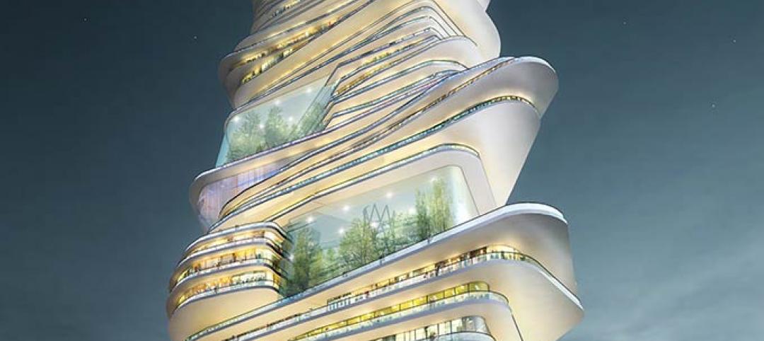
The Endless City: Skyscraper concept connects all floors with dual ramps
Rather than superimposing one floor on top of another, London-based SURE Architecture proposes two endless ramps, rising gradually with a low gradient from the ground floor to the sky.
| Aug 4, 2014
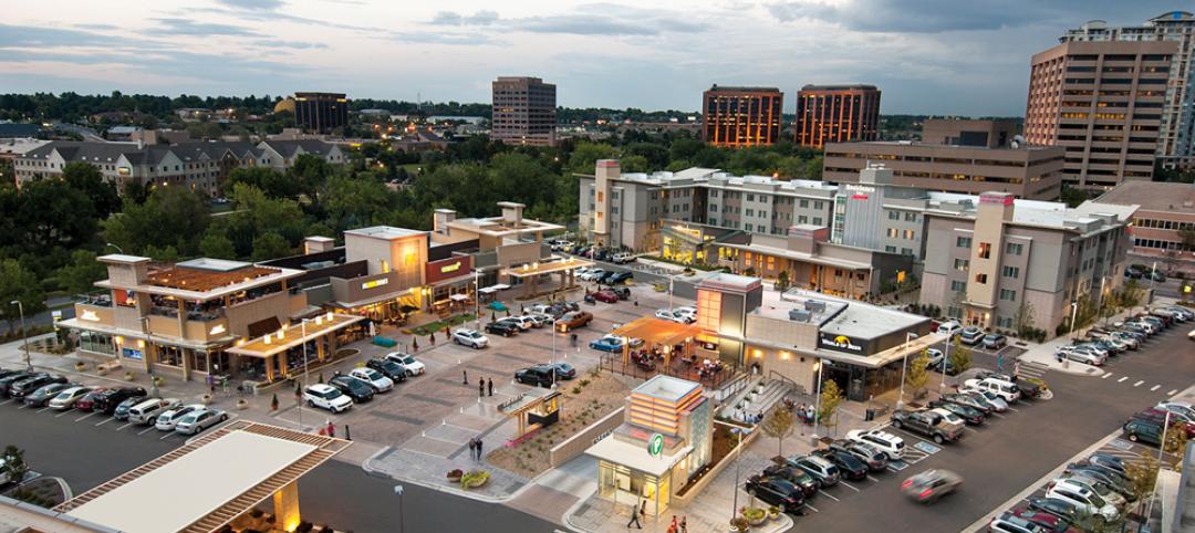
Retail Giants: Grocery-anchored centers, trophy malls among hot retail developments [2014 Giants 300 Report]
Despite the rapid growth of online shopping, the 'bricks and mortar' retail sector is faring quite well, headed by power centers, grocery-anchored centers, and trophy malls, according BD+C's 2014 Giants 300 Report.
| Jul 28, 2014
Reconstruction market benefits from improving economy, new technology [2014 Giants 300 Report]
Following years of fairly lackluster demand for commercial property remodeling, reconstruction revenue is improving, according to the 2014 Giants 300 report.
| Jul 28, 2014
Reconstruction Sector Construction Firms [2014 Giants 300 Report]
Structure Tone, Turner, and Gilbane top Building Design+Construction's 2014 ranking of the largest reconstruction contractor and construction management firms in the U.S.


