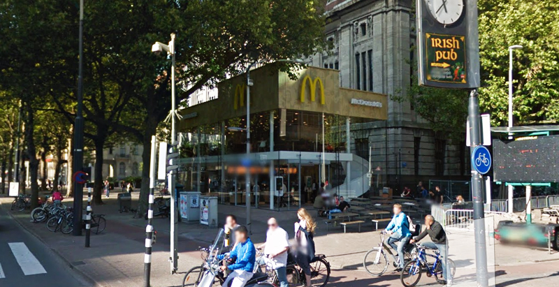
Since the 1960s, residents of the Dutch city of Rotterdam have been bugged by an unsightly cigar shop on Coolsingel, one of its busiest streets.
Years passed, and the eyesore welcomed a new tenant, the U.S.-based fast food chain McDonald’s.
For 45 years, the branch continued to operate in the dated building until finally it received a much needed facelift earlier this year, designed by Mei Architects.
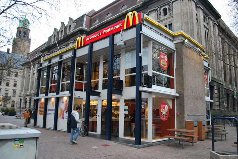 The original building
According to Dezeen, the original glass building, attached to a much older post office, was voted by Rotterdam’s residents as the ugliest structure in the city, and local officials were ready to demolish it. But McDonald’s still had 40 more years on the lease—the redesign route was taken instead.
"Since the 1970s the McDonald's pavilion has been altered frequently. Its quality suffered as a result, with its mostly closed facades. This makes the space anonymous. We want to activate this space again," the design studio’s founder, Robert Winkel, told Dezeen.
The resulting structure is a rectangular glass building with a perforated golden façade, and sleek, white grand spiral staircase. Etched to the façade is pixelated imagery of a crowd, responding to the restaurant’s bustling site. The new building was also detached from the post-office, making it seem more like a pavilion.
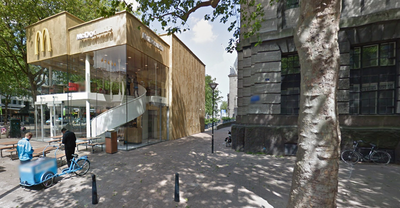 The building is now separated from the much older post office edifice, making the restaurant more like a pavilion. The golden perforated panels depict a pixelated image of a crowd.
Transparency was a key concept in the design. The color-to-ceiling window idea from the original building was kept.
"The transparency and openness, as well as the depicted crowd on the facade panels, emphasize that McDonald's is for everyone, for every Rotterdam resident," Mei Architects' Marloes Koster tells AdFreak.
Onlookers can glimpse into the kitchen as well as get a hint of the grand staircase. By day it reflects sunlight, and the building maintains its glow when sun falls.
"As McDonald's is open day and night, 24/7, its appearance after dark is important," the team told Dezeen. "By day the building is inviting to shoppers, while in the evening it glows to attract the nightlife crowd."
AdWeek reports that the building won an Iconic Award 2015 prize for excellence in architecture and design.
Related Stories
| Jul 18, 2014
Top Engineering Firms [2014 Giants 300 Report]
Fluor, Arup, Day & Zimmermann top Building Design+Construction's 2014 ranking of the largest engineering firms in the United States.
| Jul 18, 2014
Top Architecture Firms [2014 Giants 300 Report]
Gensler, Perkins+Will, NBBJ top Building Design+Construction's 2014 ranking of the largest architecture firms in the United States.
| Jul 18, 2014
2014 Giants 300 Report
Building Design+Construction magazine's annual ranking the nation's largest architecture, engineering, and construction firms in the U.S.
| Jul 17, 2014
A new, vibrant waterfront for the capital
Plans to improve Washington D.C.'s Potomac River waterfront by Maine Ave. have been discussed for years. Finally, The Wharf has started its first phase of construction.
| Jul 17, 2014
A harmful trade-off many U.S. green buildings make
The Urban Green Council addresses a concern that many "green" buildings in the U.S. have: poor insulation.
| Jul 7, 2014
7 emerging design trends in brick buildings
From wild architectural shapes to unique color blends and pattern arrangements, these projects demonstrate the design possibilities of brick.
| Jul 7, 2014
A climate-controlled city is Dubai's newest colossal project
To add to Dubai's already impressive portfolio of world's tallest tower and world's largest natural flower garden, Dubai Holding has plans to build the world's largest climate-controlled city.
| Jul 3, 2014
Gehry edits Canadian skyscraper plan to be 'more Toronto'
After being criticized for the original tower complex, architect Frank Gehry unveils a new design that is more subtle, and "more Toronto."
| Jul 2, 2014
SHoP designs what would be Brooklyn's tallest building
JDS Development partners with SHoP to construct a 70-story building at 775-feet tall, unprecedented for downtown Brooklyn.
| Jun 30, 2014
Research finds continued growth of design-build throughout United States
New research findings indicate that for the first time more than half of projects above $10 million are being completed through design-build project delivery.


