Since the 1960s, residents of the Dutch city of Rotterdam have been bugged by an unsightly cigar shop on Coolsingel, one of its busiest streets.
Years passed, and the eyesore welcomed a new tenant, the U.S.-based fast food chain McDonald’s.
For 45 years, the branch continued to operate in the dated building until finally it received a much needed facelift earlier this year, designed by Mei Architects.
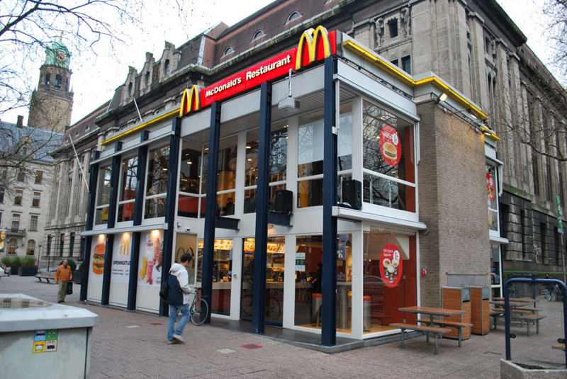
 The original building
According to Dezeen, the original glass building, attached to a much older post office, was voted by Rotterdam’s residents as the ugliest structure in the city, and local officials were ready to demolish it. But McDonald’s still had 40 more years on the lease—the redesign route was taken instead.
"Since the 1970s the McDonald's pavilion has been altered frequently. Its quality suffered as a result, with its mostly closed facades. This makes the space anonymous. We want to activate this space again," the design studio’s founder, Robert Winkel, told Dezeen.
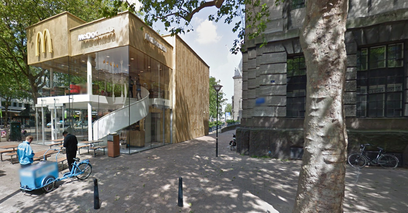
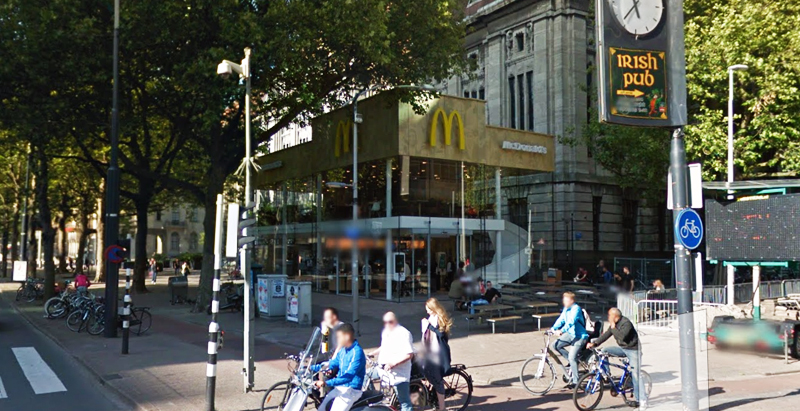
The resulting structure is a rectangular glass building with a perforated golden façade, and sleek, white grand spiral staircase. Etched to the façade is pixelated imagery of a crowd, responding to the restaurant’s bustling site. The new building was also detached from the post-office, making it seem more like a pavilion.
 The building is now separated from the much older post office edifice, making the restaurant more like a pavilion. The golden perforated panels depict a pixelated image of a crowd.
Transparency was a key concept in the design. The color-to-ceiling window idea from the original building was kept.
"The transparency and openness, as well as the depicted crowd on the facade panels, emphasize that McDonald's is for everyone, for every Rotterdam resident," Mei Architects' Marloes Koster tells AdFreak.
Onlookers can glimpse into the kitchen as well as get a hint of the grand staircase. By day it reflects sunlight, and the building maintains its glow when sun falls.
"As McDonald's is open day and night, 24/7, its appearance after dark is important," the team told Dezeen. "By day the building is inviting to shoppers, while in the evening it glows to attract the nightlife crowd."
AdWeek reports that the building won an Iconic Award 2015 prize for excellence in architecture and design.
Related Stories
| Aug 11, 2010
Manhattan's Pier 57 to be transformed into $210 million cultural center
LOT-EK, Beyer Blinder Belle, and West 8 have been selected as the design team for Hudson River Park's $210 million Pier 57 redevelopment, headed by local developer Young Woo & Associates. The 375,000-sf vacant passenger ship terminal will be transformed into a cultural center, small business incubator, and public park, including a rooftop venue for the Tribeca Film Festival.
| Aug 11, 2010
D.C. gets sweeter with expanded green eatery
Greens Restaurant Group has expanded its popular salad and yogurt eatery, sweetgreen, to two neighborhoods in the Washington, D.C., area, Dupont Circle and Bethesda, Md. Designed by local architect CORE architecture + design, the experiential dining projects use salvaged hickory for the walls, wood recycled from the old bowling alleys for the tables and chairs, and sustainable paper/dye product...
| Aug 11, 2010
U.S. firm designing massive Taiwan project
MulvannyG2 Architecture is designing one of Taipei, Taiwan's largest urban redevelopment projects. The Bellevue, Wash., firm is working with developer The Global Team Group to create Aquapearl, a mixed-use complex that's part of the Taipei government's "Good Looking Taipei 2010" initiative to spur redevelopment of the city's Songjian District.
| Aug 11, 2010
Florida mixed-use complex includes retail, residential
The $325 million Atlantic Plaza II lifestyle center will be built on 8.5 acres in Delray Beach, Fla. Designed by Vander Ploeg & Associates, Boca Raton, the complex will include six buildings ranging from three to five stories and have 182,000 sf of restaurant and retail space. An additional 106,000 sf of Class A office space and a residential component including 197 apartments, townhouses, ...
| Aug 11, 2010
Glass Wall Systems Open Up Closed Spaces
Sectioning off large open spaces without making everything feel closed off was the challenge faced by two very different projects—one an upscale food market in Napa Valley, the other a corporate office in Southern California. Movable glass wall systems proved to be the solution in both projects.
| Aug 11, 2010
CityCenter Takes Experience Design To New Heights
It's early June, in Las Vegas, which means it's very hot, and I am coming to the end of a hardhat tour of the $9.2 billion CityCenter development, a tour that began in the air-conditioned comfort of the project's immense sales center just off the famed Las Vegas Strip and ended on a rooftop overlooking the largest privately funded development in the U.
| Aug 11, 2010
The softer side of Sears
Built in 1928 as a shining Art Deco beacon for the upper Midwest, the Sears building in Minneapolis—with its 16-story central tower, department store, catalog center, and warehouse—served customers throughout the Twin Cities area for more than 65 years. But as nearby neighborhoods deteriorated and the catalog operation was shut down, by 1994 the once-grand structure was reduced to ...
| Aug 11, 2010
American Tobacco Project: Turning over a new leaf
As part of a major revitalization of downtown Durham, N.C., locally based Capitol Broadcasting Company decided to transform the American Tobacco Company's derelict 16-acre industrial plant, which symbolized the city for more than a century, into a lively and attractive mixed-use development. Although tearing down and rebuilding the property would have made more economic sense, the greater goal ...


