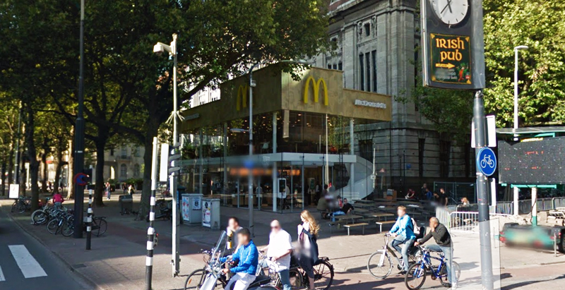
Since the 1960s, residents of the Dutch city of Rotterdam have been bugged by an unsightly cigar shop on Coolsingel, one of its busiest streets.
Years passed, and the eyesore welcomed a new tenant, the U.S.-based fast food chain McDonald’s.
For 45 years, the branch continued to operate in the dated building until finally it received a much needed facelift earlier this year, designed by Mei Architects.
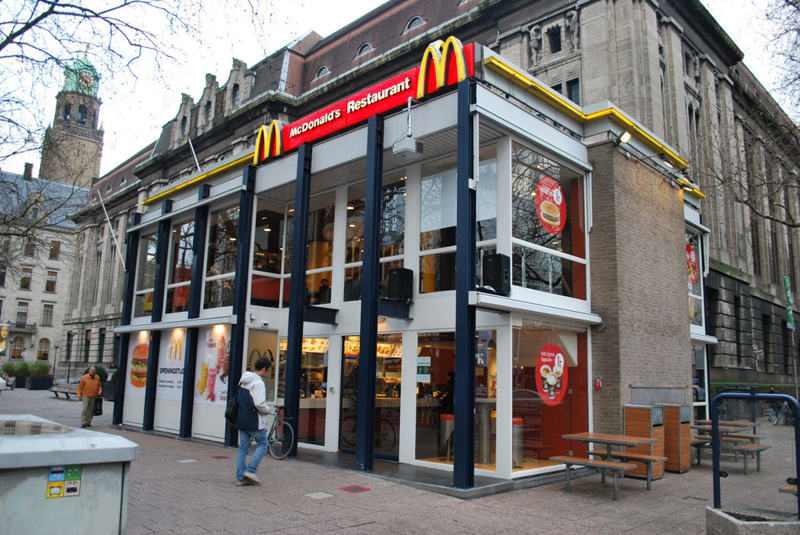 The original building
According to Dezeen, the original glass building, attached to a much older post office, was voted by Rotterdam’s residents as the ugliest structure in the city, and local officials were ready to demolish it. But McDonald’s still had 40 more years on the lease—the redesign route was taken instead.
"Since the 1970s the McDonald's pavilion has been altered frequently. Its quality suffered as a result, with its mostly closed facades. This makes the space anonymous. We want to activate this space again," the design studio’s founder, Robert Winkel, told Dezeen.
The resulting structure is a rectangular glass building with a perforated golden façade, and sleek, white grand spiral staircase. Etched to the façade is pixelated imagery of a crowd, responding to the restaurant’s bustling site. The new building was also detached from the post-office, making it seem more like a pavilion.
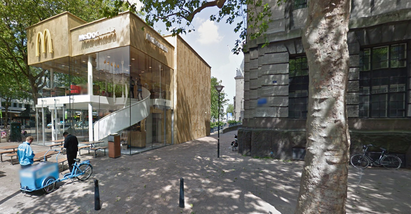 The building is now separated from the much older post office edifice, making the restaurant more like a pavilion. The golden perforated panels depict a pixelated image of a crowd.
Transparency was a key concept in the design. The color-to-ceiling window idea from the original building was kept.
"The transparency and openness, as well as the depicted crowd on the facade panels, emphasize that McDonald's is for everyone, for every Rotterdam resident," Mei Architects' Marloes Koster tells AdFreak.
Onlookers can glimpse into the kitchen as well as get a hint of the grand staircase. By day it reflects sunlight, and the building maintains its glow when sun falls.
"As McDonald's is open day and night, 24/7, its appearance after dark is important," the team told Dezeen. "By day the building is inviting to shoppers, while in the evening it glows to attract the nightlife crowd."
AdWeek reports that the building won an Iconic Award 2015 prize for excellence in architecture and design.
Related Stories
| Jan 4, 2011
Grubb & Ellis predicts commercial real estate recovery
Grubb & Ellis Company, a leading real estate services and investment firm, released its 2011 Real Estate Forecast, which foresees the start of a slow recovery in the leasing market for all property types in the coming year.
| Dec 17, 2010
Vietnam business center will combine office and residential space
The 300,000-sm VietinBank Business Center in Hanoi, Vietnam, designed by Foster + Partners, will have two commercial towers: the first, a 68-story, 362-meter office tower for the international headquarters of VietinBank; the second, a five-star hotel, spa, and serviced apartments. A seven-story podium with conference facilities, retail space, restaurants, and rooftop garden will connect the two towers. Eco-friendly features include using recycled heat from the center’s power plant to provide hot water, and installing water features and plants to improve indoor air quality. Turner Construction Co. is the general contractor.
| Dec 17, 2010
Toronto church converted for condos and shopping
Reserve Properties is transforming a 20th-century church into Bellefair Kew Beach Residences, a residential/retail complex in The Beach neighborhood of Toronto. Local architecture firm RAWdesign adapted the late Gothic-style church into a five-story condominium with 23 one- and two-bedroom units, including two-story penthouse suites. Six three-story townhouses also will be incorporated. The project will afford residents views of nearby Kew Gardens and Lake Ontario. One façade of the church was updated for retail shops.
| Nov 3, 2010
Chengdu retail center offers a blend of old and new China
The first phase of Pearl River New Town, an 80-acre project in Chengdu, in China’s Wenjiang District, is under way along the banks of the Jiang’an River. Chengdu was at one time a leading center for broadcloth production, and RTKL, which is overseeing the project’s master planning, architecture, branding, and landscape architecture, designed the project’s streets, pedestrian pathways, and bridges to resemble a woven fabric.
| Nov 1, 2010
Sustainable, mixed-income housing to revitalize community
The $41 million Arlington Grove mixed-use development in St. Louis is viewed as a major step in revitalizing the community. Developed by McCormack Baron Salazar with KAI Design & Build (architect, MEP, GC), the project will add 112 new and renovated mixed-income rental units (market rate, low-income, and public housing) totaling 162,000 sf, plus 5,000 sf of commercial/retail space.
| Nov 1, 2010
Vancouver’s former Olympic Village shoots for Gold
The first tenants of the Millennium Water development in Vancouver, B.C., were Olympic athletes competing in the 2010 Winter Games. Now the former Olympic Village, located on a 17-acre brownfield site, is being transformed into a residential neighborhood targeting LEED ND Gold. The buildings are expected to consume 30-70% less energy than comparable structures.
| Oct 12, 2010
The Watch Factory, Waltham, Mass.
27th Annual Reconstruction Awards — Gold Award. When the Boston Watch Company opened its factory in 1854 on the banks of the Charles River in Waltham, Mass., the area was far enough away from the dust, dirt, and grime of Boston to safely assemble delicate watch parts.
| Oct 6, 2010
From grocery store to culinary school
A former West Philadelphia supermarket is moving up the food chain, transitioning from grocery store to the Center for Culinary Enterprise, a business culinary training school.
| Sep 16, 2010
Gehry’s Santa Monica Place gets a wave of changes
Omniplan, in association with Jerde Partnership, created an updated design for Santa Monica Place, a shopping mall designed by Frank Gehry in 1980.
| Sep 13, 2010
3D Prototyping Goes Low-cost
Today’s less costly 3D color printers are attracting the attention of AEC firms looking to rapidly prototype designs and communicate design intent to clients.


