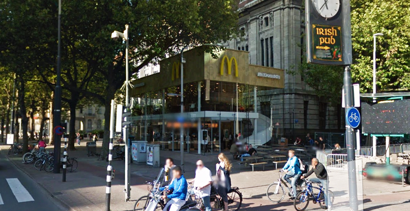
Since the 1960s, residents of the Dutch city of Rotterdam have been bugged by an unsightly cigar shop on Coolsingel, one of its busiest streets.
Years passed, and the eyesore welcomed a new tenant, the U.S.-based fast food chain McDonald’s.
For 45 years, the branch continued to operate in the dated building until finally it received a much needed facelift earlier this year, designed by Mei Architects.
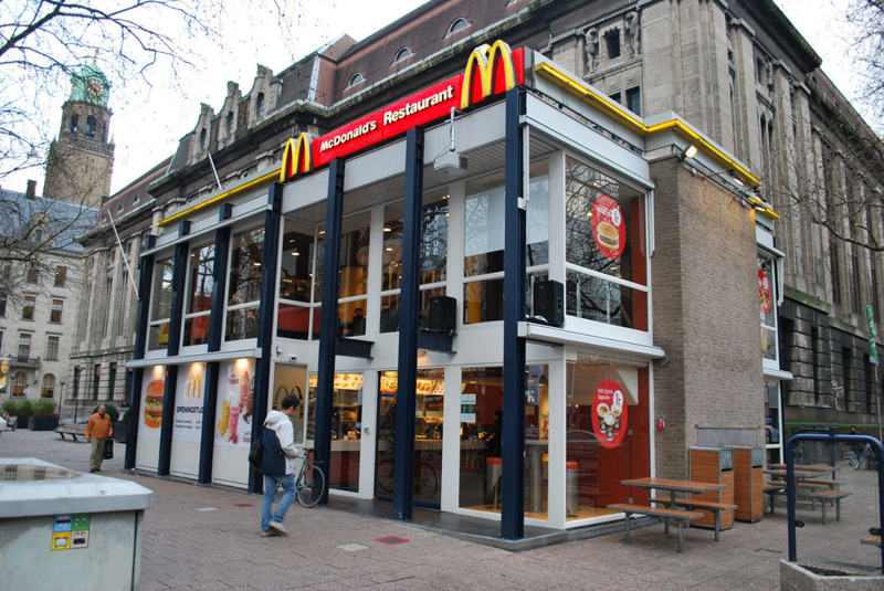 The original building
According to Dezeen, the original glass building, attached to a much older post office, was voted by Rotterdam’s residents as the ugliest structure in the city, and local officials were ready to demolish it. But McDonald’s still had 40 more years on the lease—the redesign route was taken instead.
"Since the 1970s the McDonald's pavilion has been altered frequently. Its quality suffered as a result, with its mostly closed facades. This makes the space anonymous. We want to activate this space again," the design studio’s founder, Robert Winkel, told Dezeen.
The resulting structure is a rectangular glass building with a perforated golden façade, and sleek, white grand spiral staircase. Etched to the façade is pixelated imagery of a crowd, responding to the restaurant’s bustling site. The new building was also detached from the post-office, making it seem more like a pavilion.
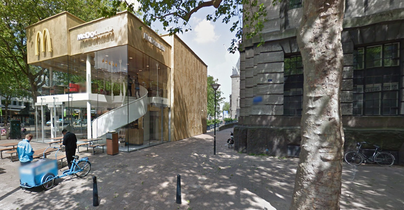 The building is now separated from the much older post office edifice, making the restaurant more like a pavilion. The golden perforated panels depict a pixelated image of a crowd.
Transparency was a key concept in the design. The color-to-ceiling window idea from the original building was kept.
"The transparency and openness, as well as the depicted crowd on the facade panels, emphasize that McDonald's is for everyone, for every Rotterdam resident," Mei Architects' Marloes Koster tells AdFreak.
Onlookers can glimpse into the kitchen as well as get a hint of the grand staircase. By day it reflects sunlight, and the building maintains its glow when sun falls.
"As McDonald's is open day and night, 24/7, its appearance after dark is important," the team told Dezeen. "By day the building is inviting to shoppers, while in the evening it glows to attract the nightlife crowd."
AdWeek reports that the building won an Iconic Award 2015 prize for excellence in architecture and design.
Related Stories
| Apr 16, 2012
Shawmut awarded Tag Heuer builds in Florida and Pennsylvania
Both projects are scheduled to be completed this spring.
| Apr 2, 2012
Sachse Construction helps complete Salt Lake City’s City Creek Center
Sachse was hired to complete store build-outs at City Creek Center.
| Mar 19, 2012
Mixed-use project redefines Midtown District in Plantation, Fla.
Stiles Construction is building the residential complex, which is one of Broward County’s first multifamily rental communities designed to achieve LEED certification from the USGBC.
| Mar 16, 2012
Work on Oxnard, Calif. shopping center resumes after a three-year hiatus
Stalled since 2009, developers of the Collection at RiverPark decided to restart construction on the outdoor mall.
| Feb 22, 2012
Suffolk awarded Boston post office renovation project
Renovation of art deco landmark will add 21,000 square feet of retail and 110 new parking spaces.
| Feb 16, 2012
Big-box retailers not just for DIYers
Nearly half of all contractor purchases made from stores like Home Depot and Lowe's.
| Feb 16, 2012
4.8-megawatt solar power system completed at Jersey Gardens Mall
Solar array among the largest rooftop systems in North America.
| Feb 15, 2012
Englewood Construction announces new projects with Destination Maternity, American Girl
Englewood’s newest project for Wisconsin-based doll retailer American Girl, the company will combine four vacant storefronts into one large 15,000 square-foot retail space for American Girl.


