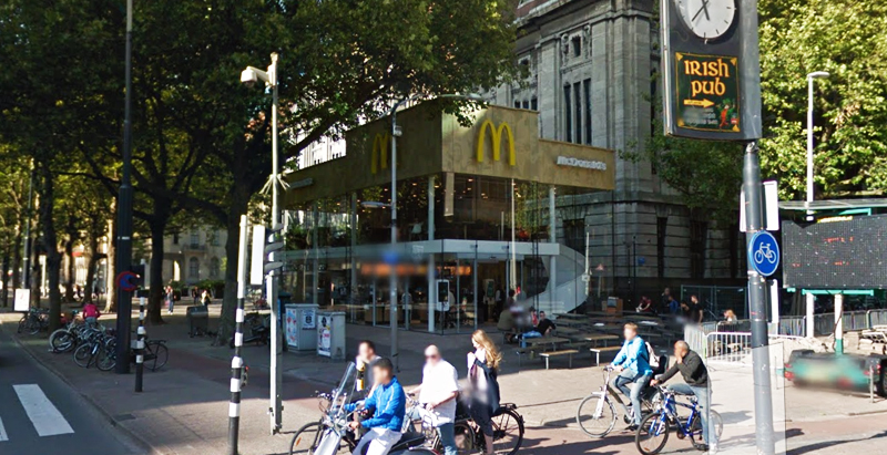
Since the 1960s, residents of the Dutch city of Rotterdam have been bugged by an unsightly cigar shop on Coolsingel, one of its busiest streets.
Years passed, and the eyesore welcomed a new tenant, the U.S.-based fast food chain McDonald’s.
For 45 years, the branch continued to operate in the dated building until finally it received a much needed facelift earlier this year, designed by Mei Architects.
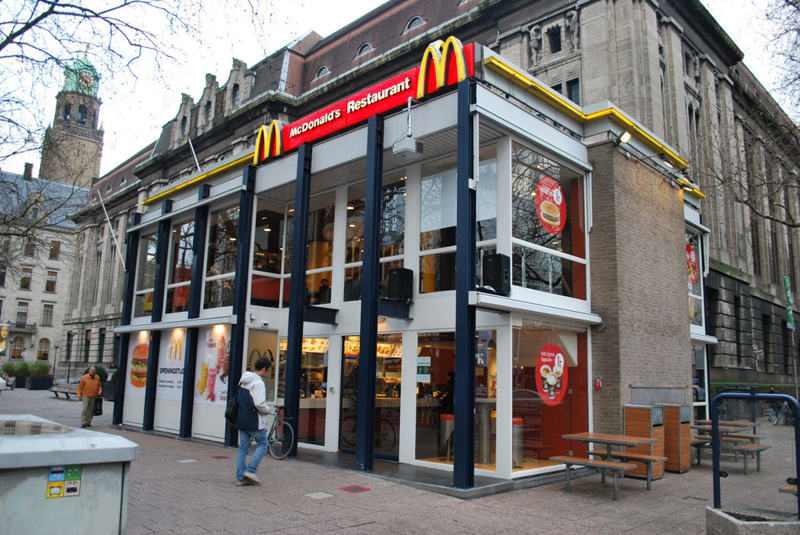 The original building
According to Dezeen, the original glass building, attached to a much older post office, was voted by Rotterdam’s residents as the ugliest structure in the city, and local officials were ready to demolish it. But McDonald’s still had 40 more years on the lease—the redesign route was taken instead.
"Since the 1970s the McDonald's pavilion has been altered frequently. Its quality suffered as a result, with its mostly closed facades. This makes the space anonymous. We want to activate this space again," the design studio’s founder, Robert Winkel, told Dezeen.
The resulting structure is a rectangular glass building with a perforated golden façade, and sleek, white grand spiral staircase. Etched to the façade is pixelated imagery of a crowd, responding to the restaurant’s bustling site. The new building was also detached from the post-office, making it seem more like a pavilion.
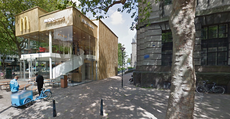 The building is now separated from the much older post office edifice, making the restaurant more like a pavilion. The golden perforated panels depict a pixelated image of a crowd.
Transparency was a key concept in the design. The color-to-ceiling window idea from the original building was kept.
"The transparency and openness, as well as the depicted crowd on the facade panels, emphasize that McDonald's is for everyone, for every Rotterdam resident," Mei Architects' Marloes Koster tells AdFreak.
Onlookers can glimpse into the kitchen as well as get a hint of the grand staircase. By day it reflects sunlight, and the building maintains its glow when sun falls.
"As McDonald's is open day and night, 24/7, its appearance after dark is important," the team told Dezeen. "By day the building is inviting to shoppers, while in the evening it glows to attract the nightlife crowd."
AdWeek reports that the building won an Iconic Award 2015 prize for excellence in architecture and design.
Related Stories
| Apr 24, 2013
Los Angeles may add cool roofs to its building code
Los Angeles Mayor Antonio Villaraigosa wants cool roofs added to the city’s building code. He is also asking the Department of Water and Power (LADWP) to create incentives that make it financially attractive for homeowners to install cool roofs.
| Apr 22, 2013
Top 10 green building projects for 2013 [slideshow]
The AIA's Committee on the Environment selected its top ten examples of sustainable architecture and green design solutions that protect and enhance the environment.
| Apr 19, 2013
7 hip high-rise developments on the drawing board
Adrian Smith and Gordon Gill's whimsical Dancing Dragons tower in Seoul is among the compelling high-rise projects in the works across the globe.
| Apr 17, 2013
Frank Lloyd Wright's Park Avenue showroom demolished
New York loses another architectural gem by Frank Lloyd Wright as new owner razes auto showroom.
| Apr 5, 2013
Commercial greenhouse will top new Whole Foods store in Brooklyn
Whole Foods and partner Gotham Greens will create a 20,000-sf greenhouse atop one of the retailer's Brooklyn supermarkets. Expected to open this fall, the facility will supply produce to nine Whole Foods stores in metro New York City.
| Apr 2, 2013
6 lobby design tips
If you do hotels, schools, student unions, office buildings, performing arts centers, transportation facilities, or any structure with a lobby, here are six principles from healthcare lobby design that make for happier users—and more satisfied owners.


