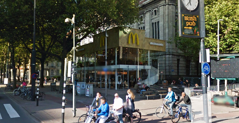
Since the 1960s, residents of the Dutch city of Rotterdam have been bugged by an unsightly cigar shop on Coolsingel, one of its busiest streets.
Years passed, and the eyesore welcomed a new tenant, the U.S.-based fast food chain McDonald’s.
For 45 years, the branch continued to operate in the dated building until finally it received a much needed facelift earlier this year, designed by Mei Architects.
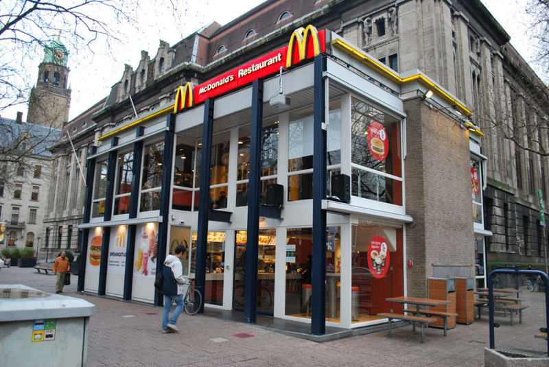 The original building
According to Dezeen, the original glass building, attached to a much older post office, was voted by Rotterdam’s residents as the ugliest structure in the city, and local officials were ready to demolish it. But McDonald’s still had 40 more years on the lease—the redesign route was taken instead.
"Since the 1970s the McDonald's pavilion has been altered frequently. Its quality suffered as a result, with its mostly closed facades. This makes the space anonymous. We want to activate this space again," the design studio’s founder, Robert Winkel, told Dezeen.
The resulting structure is a rectangular glass building with a perforated golden façade, and sleek, white grand spiral staircase. Etched to the façade is pixelated imagery of a crowd, responding to the restaurant’s bustling site. The new building was also detached from the post-office, making it seem more like a pavilion.
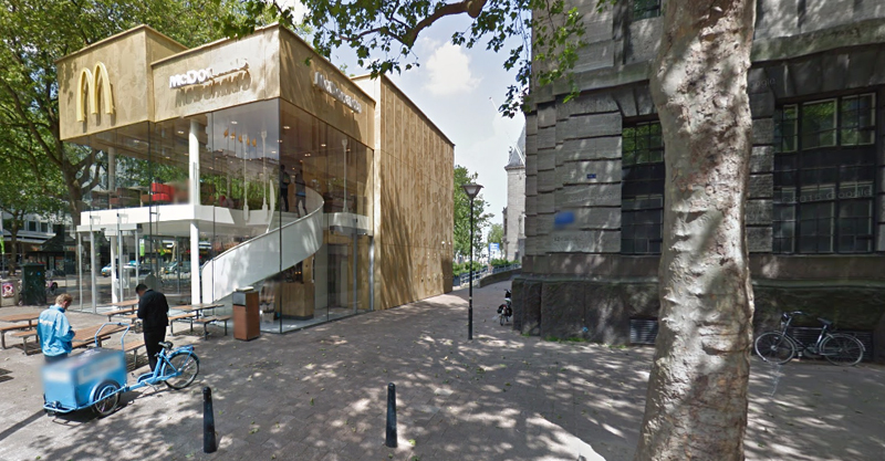 The building is now separated from the much older post office edifice, making the restaurant more like a pavilion. The golden perforated panels depict a pixelated image of a crowd.
Transparency was a key concept in the design. The color-to-ceiling window idea from the original building was kept.
"The transparency and openness, as well as the depicted crowd on the facade panels, emphasize that McDonald's is for everyone, for every Rotterdam resident," Mei Architects' Marloes Koster tells AdFreak.
Onlookers can glimpse into the kitchen as well as get a hint of the grand staircase. By day it reflects sunlight, and the building maintains its glow when sun falls.
"As McDonald's is open day and night, 24/7, its appearance after dark is important," the team told Dezeen. "By day the building is inviting to shoppers, while in the evening it glows to attract the nightlife crowd."
AdWeek reports that the building won an Iconic Award 2015 prize for excellence in architecture and design.
Related Stories
| Mar 15, 2013
7 most endangered buildings in Chicago
The Chicago Preservation Society released its annual list of the buildings at high risk for demolition.
| Mar 14, 2013
25 cities with the most Energy Star certified buildings
Los Angeles, Washington, D.C., and Chicago top EPA's list of the U.S. cities with the greatest number of Energy Star certified buildings in 2012.
| Mar 10, 2013
Walgreens to build first net-zero energy retail store
Walgreens announced plans last week to build one of the nation's first net-zero retail stores. The Evanston, Ill., location will utilize solar panels, wind turbines, geothermal technology, LED lighting and ultra-high-efficiency refrigeration to produce energy equal to or greater than the building consumes.
| Mar 7, 2013
Vegas rebound: Genting Group acquires assets of stalled Vegas casino-resort
International hospitality giant Genting Group has announced a deal with Boyd Gaming Corp. to purchase the land and assets, including partially built structures, of the stalled Echelon casino-resort in Las Vegas.
| Mar 4, 2013
Korean Air, AC Martin collaborating on Western region's tallest tower
The 1,100-foot Wilshire Grand will combine retail and restaurant space, offices, and a luxury hotel in the sky.
| Feb 22, 2013
Starbucks pilot program rolls out small, modular stores
Coffee giant Starbucks is rolling out mini-stores with maximum local flavor, as part of an international pilot program.
| Feb 21, 2013
Holl videos discuss design features of Chengdu ' Porosity Block' project
Architect Steven Holl has released two short films describing the development of Sliced Porosity Block in Chengdu, China.
| Feb 20, 2013
Higher standards, efficiency programs keys to 40% energy usage reduction in commercial buildings since 1980
Commercial buildings have seen a drop in their energy intensity of more than 40% since 1980, according to a recent report from Bloomberg New Energy Finance and the Business Council for Sustainable Energy.


