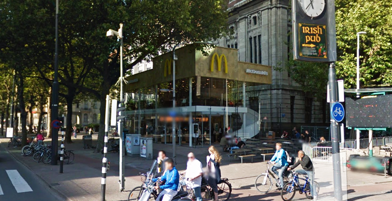
Since the 1960s, residents of the Dutch city of Rotterdam have been bugged by an unsightly cigar shop on Coolsingel, one of its busiest streets.
Years passed, and the eyesore welcomed a new tenant, the U.S.-based fast food chain McDonald’s.
For 45 years, the branch continued to operate in the dated building until finally it received a much needed facelift earlier this year, designed by Mei Architects.
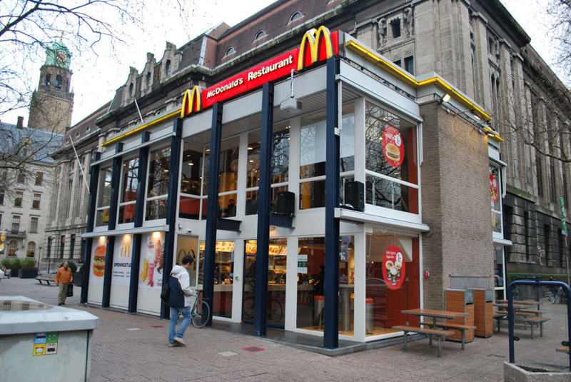 The original building
According to Dezeen, the original glass building, attached to a much older post office, was voted by Rotterdam’s residents as the ugliest structure in the city, and local officials were ready to demolish it. But McDonald’s still had 40 more years on the lease—the redesign route was taken instead.
"Since the 1970s the McDonald's pavilion has been altered frequently. Its quality suffered as a result, with its mostly closed facades. This makes the space anonymous. We want to activate this space again," the design studio’s founder, Robert Winkel, told Dezeen.
The resulting structure is a rectangular glass building with a perforated golden façade, and sleek, white grand spiral staircase. Etched to the façade is pixelated imagery of a crowd, responding to the restaurant’s bustling site. The new building was also detached from the post-office, making it seem more like a pavilion.
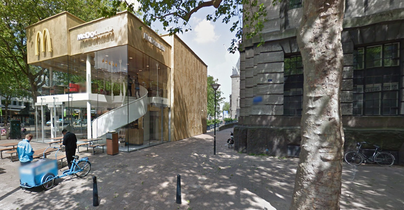 The building is now separated from the much older post office edifice, making the restaurant more like a pavilion. The golden perforated panels depict a pixelated image of a crowd.
Transparency was a key concept in the design. The color-to-ceiling window idea from the original building was kept.
"The transparency and openness, as well as the depicted crowd on the facade panels, emphasize that McDonald's is for everyone, for every Rotterdam resident," Mei Architects' Marloes Koster tells AdFreak.
Onlookers can glimpse into the kitchen as well as get a hint of the grand staircase. By day it reflects sunlight, and the building maintains its glow when sun falls.
"As McDonald's is open day and night, 24/7, its appearance after dark is important," the team told Dezeen. "By day the building is inviting to shoppers, while in the evening it glows to attract the nightlife crowd."
AdWeek reports that the building won an Iconic Award 2015 prize for excellence in architecture and design.
Related Stories
| Jul 20, 2012
Global boom for hotels; for retail, not so much
The Giants 300 Top 10 Firms in the Hospitality and Retail sectors.
| Jul 17, 2012
KM/Plaza changes name to Plaza Construction
Lands new projects including the Perry South Beach Hotel and Dadeland Mall Kendall Wing Expansion.
| Jun 1, 2012
New BD+C University Course on Insulated Metal Panels available
By completing this course, you earn 1.0 HSW/SD AIA Learning Units.
| May 29, 2012
Reconstruction Awards Entry Information
Download a PDF of the Entry Information at the bottom of this page.
| May 24, 2012
2012 Reconstruction Awards Entry Form
Download a PDF of the Entry Form at the bottom of this page.
| Apr 30, 2012
HSA Commercial selected as consultant for Orland Park’s Main Street Triangle project
HSA will be responsible for designing an overall mixed-use merchandise plan, attracting a unique retail tenant mix and completing leases with prospective tenants.
| Apr 20, 2012
Shawmut completes Yard House Restaurant in Boston
12,000-sf restaurant marks new addition to Boston’s Fenway neighborhood.
| Apr 19, 2012
KTGY Group’s Arista Uptown Apartments in Broomfield, Colo. completed
First of eight buildings highlights unique amenities.
| Apr 16, 2012
University of Michigan study seeks to create efficient building design
The result, the researchers say, could be technologies capable of cutting the carbon footprint created by the huge power demands buildings place on the nation’s electrical grid.


