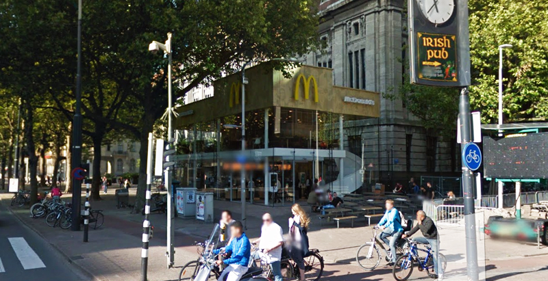
Since the 1960s, residents of the Dutch city of Rotterdam have been bugged by an unsightly cigar shop on Coolsingel, one of its busiest streets.
Years passed, and the eyesore welcomed a new tenant, the U.S.-based fast food chain McDonald’s.
For 45 years, the branch continued to operate in the dated building until finally it received a much needed facelift earlier this year, designed by Mei Architects.
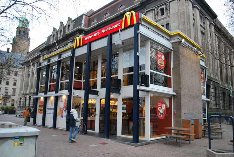 The original building
According to Dezeen, the original glass building, attached to a much older post office, was voted by Rotterdam’s residents as the ugliest structure in the city, and local officials were ready to demolish it. But McDonald’s still had 40 more years on the lease—the redesign route was taken instead.
"Since the 1970s the McDonald's pavilion has been altered frequently. Its quality suffered as a result, with its mostly closed facades. This makes the space anonymous. We want to activate this space again," the design studio’s founder, Robert Winkel, told Dezeen.
The resulting structure is a rectangular glass building with a perforated golden façade, and sleek, white grand spiral staircase. Etched to the façade is pixelated imagery of a crowd, responding to the restaurant’s bustling site. The new building was also detached from the post-office, making it seem more like a pavilion.
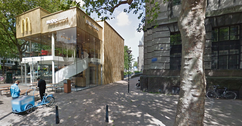 The building is now separated from the much older post office edifice, making the restaurant more like a pavilion. The golden perforated panels depict a pixelated image of a crowd.
Transparency was a key concept in the design. The color-to-ceiling window idea from the original building was kept.
"The transparency and openness, as well as the depicted crowd on the facade panels, emphasize that McDonald's is for everyone, for every Rotterdam resident," Mei Architects' Marloes Koster tells AdFreak.
Onlookers can glimpse into the kitchen as well as get a hint of the grand staircase. By day it reflects sunlight, and the building maintains its glow when sun falls.
"As McDonald's is open day and night, 24/7, its appearance after dark is important," the team told Dezeen. "By day the building is inviting to shoppers, while in the evening it glows to attract the nightlife crowd."
AdWeek reports that the building won an Iconic Award 2015 prize for excellence in architecture and design.
Related Stories
| Sep 23, 2011
Under 40 Leadership Summit
Building Design+Construction’s Under 40 Leadership Summit takes place October 26-28, 2011 Hotel at the Monteleone in New Orleans. Discounted hotel rate deadline: October 2, 2011.
| May 17, 2011
Redesigning, redefining the grocery shopping experience
The traditional 40,000- to 60,000-sf grocery store is disappearing and much of the change is happening in the city. Urban infill sites and mixed-use projects offer grocers a rare opportunity to repackage themselves into smaller, more efficient, and more convenient retail outlets. And the AEC community will have a hand in developing how these facilities will look and operate.
| Apr 12, 2011
Retail complex enjoys prime Abu Dhabi location
The Galleria at Sowwah Square in Abu Dhabi will be built in a prime location within Sowwah Island that also includes a five-star Four Seasons Hotel, the healthcare facility Cleveland Clinic Abu Dhabi, and nearly two million sf of Class A office space.
| Mar 30, 2011
Big-box giants downsize, open smaller, urban stores
As U.S. chain retailers absorb the lessons of the Great Recession, many big-box chains have started to shrink average store footprints to reflect the growing importance of multi-channel shopping, adapt to urban settings, and recognize the need to optimize portfolios. Wal-Mart, Target, Best Buy, and the Gap, among others, all have small concepts in the works or are adapting existing ones. These smaller store formats should allow the retailers to maximize profitability and open more stores in closer proximity to each other.
| Mar 22, 2011
Mayor Bloomberg unveils plans for New York City’s largest new affordable housing complex since the ’70s
Plans for Hunter’s Point South, the largest new affordable housing complex to be built in New York City since the 1970s, include new residences for 5,000 families, with more than 900 in this first phase. A development team consisting of Phipps Houses, Related Companies, and Monadnock Construction has been selected to build the residential portion of the first phase of the Queens waterfront complex, which includes two mixed-use buildings comprising more than 900 housing units and roughly 20,000 square feet of new retail space.
| Feb 23, 2011
Unprecedented green building dispute could cost developer $122.3 Million
A massive 4.5 million-sf expansion of the Carousel Center shopping complex in Syracuse, N.Y., a project called Destiny USA, allegedly failed to incorporate green building components that developers had promised the federal government—including LEED certification. As a result, the project could lose its tax-exempt status, which reportedly saved developer The Pyramid Cos. $120 million, and the firm could be penalized $2.3 million by the IRS.


