Since the 1960s, residents of the Dutch city of Rotterdam have been bugged by an unsightly cigar shop on Coolsingel, one of its busiest streets.
Years passed, and the eyesore welcomed a new tenant, the U.S.-based fast food chain McDonald’s.
For 45 years, the branch continued to operate in the dated building until finally it received a much needed facelift earlier this year, designed by Mei Architects.
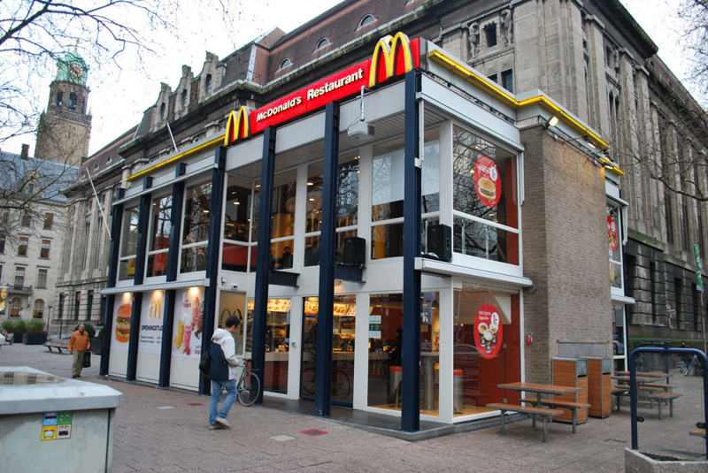
 The original building
According to Dezeen, the original glass building, attached to a much older post office, was voted by Rotterdam’s residents as the ugliest structure in the city, and local officials were ready to demolish it. But McDonald’s still had 40 more years on the lease—the redesign route was taken instead.
"Since the 1970s the McDonald's pavilion has been altered frequently. Its quality suffered as a result, with its mostly closed facades. This makes the space anonymous. We want to activate this space again," the design studio’s founder, Robert Winkel, told Dezeen.
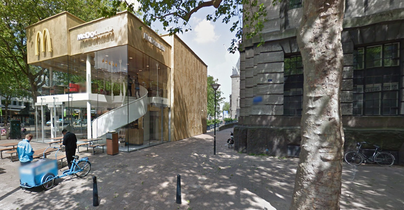
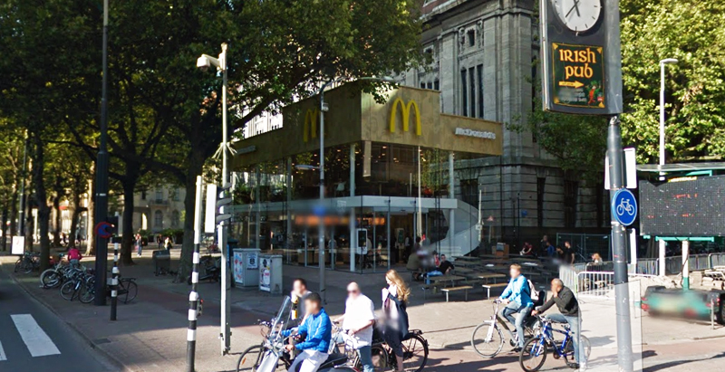
The resulting structure is a rectangular glass building with a perforated golden façade, and sleek, white grand spiral staircase. Etched to the façade is pixelated imagery of a crowd, responding to the restaurant’s bustling site. The new building was also detached from the post-office, making it seem more like a pavilion.
 The building is now separated from the much older post office edifice, making the restaurant more like a pavilion. The golden perforated panels depict a pixelated image of a crowd.
Transparency was a key concept in the design. The color-to-ceiling window idea from the original building was kept.
"The transparency and openness, as well as the depicted crowd on the facade panels, emphasize that McDonald's is for everyone, for every Rotterdam resident," Mei Architects' Marloes Koster tells AdFreak.
Onlookers can glimpse into the kitchen as well as get a hint of the grand staircase. By day it reflects sunlight, and the building maintains its glow when sun falls.
"As McDonald's is open day and night, 24/7, its appearance after dark is important," the team told Dezeen. "By day the building is inviting to shoppers, while in the evening it glows to attract the nightlife crowd."
AdWeek reports that the building won an Iconic Award 2015 prize for excellence in architecture and design.
Related Stories
| Aug 11, 2010
Best AEC Firms of 2011/12
Later this year, we will launch Best AEC Firms 2012. We’re looking for firms that create truly positive workplaces for their AEC professionals and support staff. Keep an eye on this page for entry information. +
| Aug 11, 2010
Call for entries: Building enclosure design awards
The Boston Society of Architects and the Boston chapter of the Building Enclosure Council (BEC-Boston) have announced a High Performance Building award that will assess building enclosure innovation through the demonstrated design, construction, and operation of the building enclosure.
| Aug 11, 2010
Portland Cement Association offers blast resistant design guide for reinforced concrete structures
Developed for designers and engineers, "Blast Resistant Design Guide for Reinforced Concrete Structures" provides a practical treatment of the design of cast-in-place reinforced concrete structures to resist the effects of blast loads. It explains the principles of blast-resistant design, and how to determine the kind and degree of resistance a structure needs as well as how to specify the required materials and details.
| Aug 11, 2010
New website highlights government tax incentives for large commercial buildings
Energy Retrofit Group (ERG), the subsidiary of 40-year-old, award-winning Adache Group Architects, Inc., has announced the creation of their new energy conservation web site: www.energy-rg.com.
| Aug 11, 2010
Gensler, HOK, HDR among the nation's leading reconstruction design firms, according to BD+C's Giants 300 report
A ranking of the Top 100 Reconstruction Design Firms based on Building Design+Construction's 2009 Giants 300 survey. For more Giants 300 rankings, visit http://www.BDCnetwork.com/Giants
| Aug 11, 2010
Callison strengthens retail design presence with RYA acquisition
Callison LLC on June 1 acquired RYA Design Consultancy, a Dallas-based retail architecture and design firm with offices in New York City. The new “Callison RYA Studio” will merge staff and clients into Callison ’s existing retail practice at their Dallas and New York offices.
| Aug 11, 2010
ASHRAE introduces building energy label prototype
Most of us know the fuel efficiency of our cars, but what about our buildings? ASHRAE is working to change that, moving one step closer today to introducing its building energy labeling program with release of a prototype label at its 2009 Annual Conference in Louisville, Ky.
| Aug 11, 2010
10 tips for mitigating influenza in buildings
Adopting simple, common-sense measures and proper maintenance protocols can help mitigate the spread of influenza in buildings. In addition, there are system upgrades that can be performed to further mitigate risks. Trane Commercial Systems offers 10 tips to consider during the cold and flu season.


