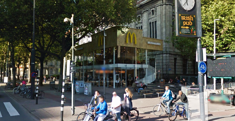
Since the 1960s, residents of the Dutch city of Rotterdam have been bugged by an unsightly cigar shop on Coolsingel, one of its busiest streets.
Years passed, and the eyesore welcomed a new tenant, the U.S.-based fast food chain McDonald’s.
For 45 years, the branch continued to operate in the dated building until finally it received a much needed facelift earlier this year, designed by Mei Architects.
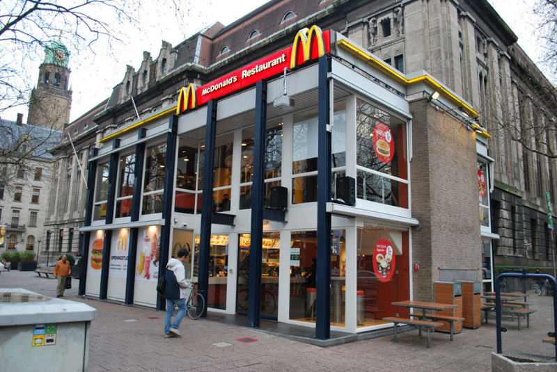 The original building
According to Dezeen, the original glass building, attached to a much older post office, was voted by Rotterdam’s residents as the ugliest structure in the city, and local officials were ready to demolish it. But McDonald’s still had 40 more years on the lease—the redesign route was taken instead.
"Since the 1970s the McDonald's pavilion has been altered frequently. Its quality suffered as a result, with its mostly closed facades. This makes the space anonymous. We want to activate this space again," the design studio’s founder, Robert Winkel, told Dezeen.
The resulting structure is a rectangular glass building with a perforated golden façade, and sleek, white grand spiral staircase. Etched to the façade is pixelated imagery of a crowd, responding to the restaurant’s bustling site. The new building was also detached from the post-office, making it seem more like a pavilion.
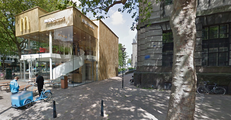 The building is now separated from the much older post office edifice, making the restaurant more like a pavilion. The golden perforated panels depict a pixelated image of a crowd.
Transparency was a key concept in the design. The color-to-ceiling window idea from the original building was kept.
"The transparency and openness, as well as the depicted crowd on the facade panels, emphasize that McDonald's is for everyone, for every Rotterdam resident," Mei Architects' Marloes Koster tells AdFreak.
Onlookers can glimpse into the kitchen as well as get a hint of the grand staircase. By day it reflects sunlight, and the building maintains its glow when sun falls.
"As McDonald's is open day and night, 24/7, its appearance after dark is important," the team told Dezeen. "By day the building is inviting to shoppers, while in the evening it glows to attract the nightlife crowd."
AdWeek reports that the building won an Iconic Award 2015 prize for excellence in architecture and design.
Related Stories
| Feb 14, 2013
Firestone projects recognized for roofing excellence
Firestone Building Products has been awarded the 2012 RoofPoint Excellence in Design Award in two categories: Global Leadership and Advancing Sustainable Roofing.
| Feb 13, 2013
Department store concept by OMA's Koolhaas, Alsaka draws inspiration from open-air Arab marketplaces
The Exhibition Hall, a retail concept planned in Kuwait City's 360° Mall, will meld cultural and commerce spaces in a series of galleries reminiscent of the long passages of the souq—traditional, open-air marketplaces found in Arab cities.
| Feb 13, 2013
China plans new car-free city
A new urban development near Chengdu, China, will provide new housing for ~80,000 people, surrounded by green space.
| Dec 9, 2012
AEC professionals cautiously optimistic about commercial construction in ’13
Most economists say the U.S. is slowly emerging from the Great Recession, a view that was confirmed to some extent by an exclusive survey of 498 BD+C subscribers whose views we sought on the commercial construction industry’s outlook on business prospects for 2013.
| Sep 20, 2012
Mid-box retail study shows lack of available sites in Chicago
Existing supply is tight everywhere and almost non-existent in the most attractive zones.
| Aug 21, 2012
Hong Kong’s first LEED Platinum pre-certified building opens
Environmentally-sensitive features have been incorporated, including reduced operational CO2 emissions, and providing occupiers with more choice in creating a suitable working environment.
| Jul 24, 2012
Dragon Valley Retail at epicenter of Yongsan International Business District
Masterplanned by architect Daniel Libeskind, the Yongsan IBD encompasses ten city blocks and includes a collection of high-rise residences and commercial buildings.
| Jul 23, 2012
Missner Group completes construction of Chicago auto dealership
The Missner Group also incorporated numerous sustainable improvements to the property including the implementation of a vegetative roof, and the utilization of permeable pavers for the parking lot.
| Jul 20, 2012
2012 Giants 300 Special Report
Ranking the leading firms in Architecture, Engineering, and Construction.


