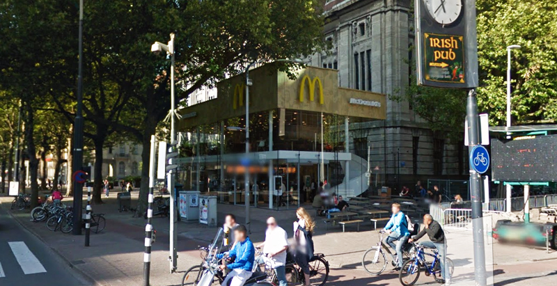
Since the 1960s, residents of the Dutch city of Rotterdam have been bugged by an unsightly cigar shop on Coolsingel, one of its busiest streets.
Years passed, and the eyesore welcomed a new tenant, the U.S.-based fast food chain McDonald’s.
For 45 years, the branch continued to operate in the dated building until finally it received a much needed facelift earlier this year, designed by Mei Architects.
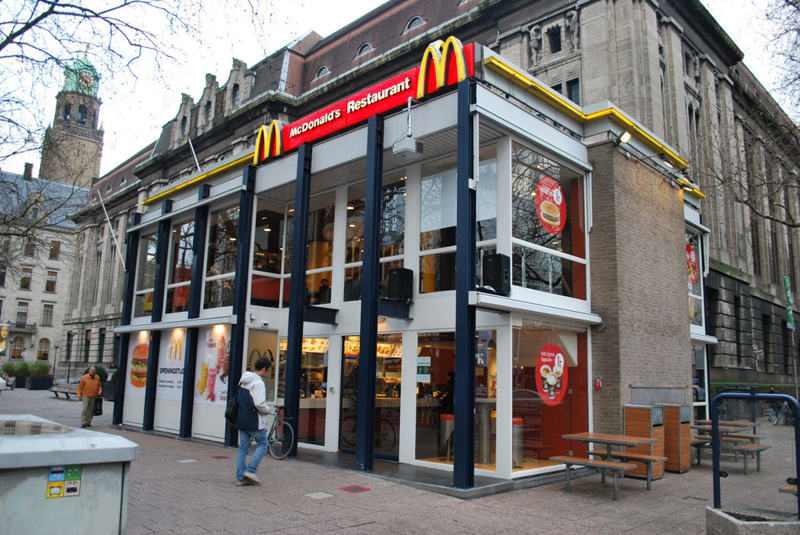 The original building
According to Dezeen, the original glass building, attached to a much older post office, was voted by Rotterdam’s residents as the ugliest structure in the city, and local officials were ready to demolish it. But McDonald’s still had 40 more years on the lease—the redesign route was taken instead.
"Since the 1970s the McDonald's pavilion has been altered frequently. Its quality suffered as a result, with its mostly closed facades. This makes the space anonymous. We want to activate this space again," the design studio’s founder, Robert Winkel, told Dezeen.
The resulting structure is a rectangular glass building with a perforated golden façade, and sleek, white grand spiral staircase. Etched to the façade is pixelated imagery of a crowd, responding to the restaurant’s bustling site. The new building was also detached from the post-office, making it seem more like a pavilion.
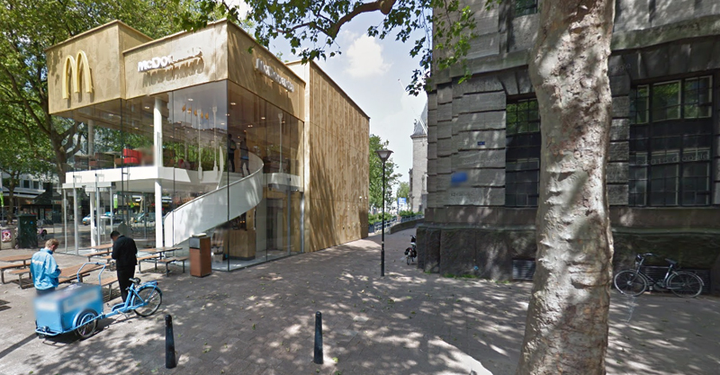 The building is now separated from the much older post office edifice, making the restaurant more like a pavilion. The golden perforated panels depict a pixelated image of a crowd.
Transparency was a key concept in the design. The color-to-ceiling window idea from the original building was kept.
"The transparency and openness, as well as the depicted crowd on the facade panels, emphasize that McDonald's is for everyone, for every Rotterdam resident," Mei Architects' Marloes Koster tells AdFreak.
Onlookers can glimpse into the kitchen as well as get a hint of the grand staircase. By day it reflects sunlight, and the building maintains its glow when sun falls.
"As McDonald's is open day and night, 24/7, its appearance after dark is important," the team told Dezeen. "By day the building is inviting to shoppers, while in the evening it glows to attract the nightlife crowd."
AdWeek reports that the building won an Iconic Award 2015 prize for excellence in architecture and design.
Related Stories
Coronavirus | Jan 20, 2022
Advances and challenges in improving indoor air quality in commercial buildings
Michael Dreidger, CEO of IAQ tech startup Airsset speaks with BD+C's John Caulfield about how building owners and property managers can improve their buildings' air quality.
Retail Centers | Jan 13, 2022
6 strategies for giving new life to ghost retail buildings
There is a tremendous opportunity to repurposing these “ghost stores” from taking advantage of the embodied carbon of the site to increased economic incentive for communities.
Retail Centers | Jan 2, 2022
A national developer is betting on a retail rebound
A 700,000-sf power center near Phoenix is one of SimonCRE’s developments nationwide.
Retail Centers | Nov 28, 2021
Robotic bar opens in Amsterdam
The venue offers a contact-free experience.
Retail Centers | Nov 16, 2021
New Papa Johns restaurant design will streamline the customer experience
The restaurant redesign brings with it a new logo and brand identity.
Giants 400 | Oct 22, 2021
2021 Retail Giants: Top architecture, engineering, and construction firms in the U.S. retail building sector
Gensler, CallisonRTKL, Kimley-Horn, and Whiting-Turner top BD+C's rankings of the nation's largest retail sector architecture, engineering, and construction firms, as reported in the 2021 Giants 400 Report.
Retail Centers | Oct 4, 2021
A new report reimagines convenience retailing without forgetting the past
Execs from HFA and Bona Design Lab say stores need to prepare for a future that might include EV chargers, food service, and even cannabis sales.
Architects | Sep 1, 2021
Design unveiled for Copia Vineyards Winery and Tasting Room
Clayton Korte designed the project.
Giants 400 | Aug 30, 2021
2021 Giants 400 Report: Ranking the largest architecture, engineering, and construction firms in the U.S.
The 2021 Giants 400 Report includes more than 130 rankings across 25 building sectors and specialty categories.
Retail Centers | Aug 27, 2021
Jewel Box retail building under construction at Miami Worldcenter
The project is one of the last remaining retail components of the $4 billion project.


