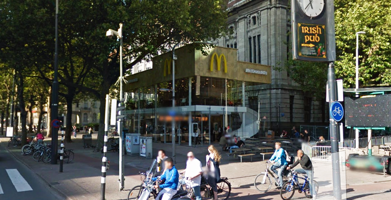
Since the 1960s, residents of the Dutch city of Rotterdam have been bugged by an unsightly cigar shop on Coolsingel, one of its busiest streets.
Years passed, and the eyesore welcomed a new tenant, the U.S.-based fast food chain McDonald’s.
For 45 years, the branch continued to operate in the dated building until finally it received a much needed facelift earlier this year, designed by Mei Architects.
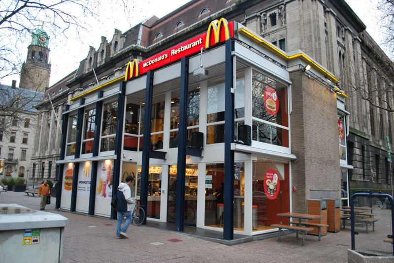 The original building
According to Dezeen, the original glass building, attached to a much older post office, was voted by Rotterdam’s residents as the ugliest structure in the city, and local officials were ready to demolish it. But McDonald’s still had 40 more years on the lease—the redesign route was taken instead.
"Since the 1970s the McDonald's pavilion has been altered frequently. Its quality suffered as a result, with its mostly closed facades. This makes the space anonymous. We want to activate this space again," the design studio’s founder, Robert Winkel, told Dezeen.
The resulting structure is a rectangular glass building with a perforated golden façade, and sleek, white grand spiral staircase. Etched to the façade is pixelated imagery of a crowd, responding to the restaurant’s bustling site. The new building was also detached from the post-office, making it seem more like a pavilion.
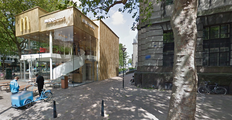 The building is now separated from the much older post office edifice, making the restaurant more like a pavilion. The golden perforated panels depict a pixelated image of a crowd.
Transparency was a key concept in the design. The color-to-ceiling window idea from the original building was kept.
"The transparency and openness, as well as the depicted crowd on the facade panels, emphasize that McDonald's is for everyone, for every Rotterdam resident," Mei Architects' Marloes Koster tells AdFreak.
Onlookers can glimpse into the kitchen as well as get a hint of the grand staircase. By day it reflects sunlight, and the building maintains its glow when sun falls.
"As McDonald's is open day and night, 24/7, its appearance after dark is important," the team told Dezeen. "By day the building is inviting to shoppers, while in the evening it glows to attract the nightlife crowd."
AdWeek reports that the building won an Iconic Award 2015 prize for excellence in architecture and design.
Related Stories
Resiliency | Aug 19, 2021
White paper outlines cost-effective flood protection approaches for building owners
A new white paper from Walter P Moore offers an in-depth review of the flood protection process and proven approaches.
Retail Centers | Aug 13, 2021
Taco Bell Defy will revolutionize the drive-thru experience
Taco Bell has partnered with Vertical Works and Border Foods on the project.
Retail Centers | Aug 12, 2021
Taco Bell Defy will revolutionize the drive-thru experience
Taco Bell has partnered with Vertical Works and Border Foods on the project.
Retail Centers | Aug 10, 2021
Retail reset: The future of shopping malls
Developers and design partners are coming together to reimagine how malls can create a new generation of mixed-use opportunities.
Contractors | Jul 23, 2021
The aggressive growth of Salas O'Brien, with CEO Darin Anderson
Engineering firm Salas O'Brien has made multiple acquisitions over the past two years to achieve its Be Local Everywhere business model. In this exclusive interview for HorizonTV, BD+C's John Caulfield sits down with the firm's Chairman and CEO, Darin Anderson, to discuss its business model.
Retail Centers | Jul 15, 2021
Design unveiled for ALDI Corner Store, a small-format model for urban settings
Landini Associates designed the project.
Daylighting Designs | Jul 9, 2021
New daylighting diffusers come in three shape options
Solatube introduces its newest technology innovation to its commercial product line, the OptiView Shaping Diffusers.
Resiliency | Jun 24, 2021
Oceanographer John Englander talks resiliency and buildings [new on HorizonTV]
New on HorizonTV, oceanographer John Englander discusses his latest book, which warns that, regardless of resilience efforts, sea levels will rise by meters in the coming decades. Adaptation, he says, is the key to future building design and construction.
Digital Twin | May 24, 2021
Digital twin’s value propositions for the built environment, explained
Ernst & Young’s white paper makes its cases for the technology’s myriad benefits.
Retail Centers | Mar 18, 2021
The Weekly Show, March 18, 2021: The future of gas stations, and HOK's Bill Hellmuth on navigating challenging markets
This week on The Weekly show, BD+C editors speak with AEC industry leaders about the future of gas stations as places that go beyond fueling, and AEC firm leadership lessons from HOK's Bill Hellmuth.




![Oceanographer John Englander talks resiliency and buildings [new on HorizonTV] Oceanographer John Englander talks resiliency and buildings [new on HorizonTV]](/sites/default/files/styles/list_big/public/Oceanographer%20John%20Englander%20Talks%20Resiliency%20and%20Buildings%20YT%20new_0.jpg?itok=enJ1TWJ8)
