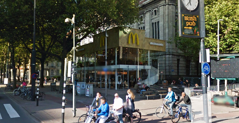
Since the 1960s, residents of the Dutch city of Rotterdam have been bugged by an unsightly cigar shop on Coolsingel, one of its busiest streets.
Years passed, and the eyesore welcomed a new tenant, the U.S.-based fast food chain McDonald’s.
For 45 years, the branch continued to operate in the dated building until finally it received a much needed facelift earlier this year, designed by Mei Architects.
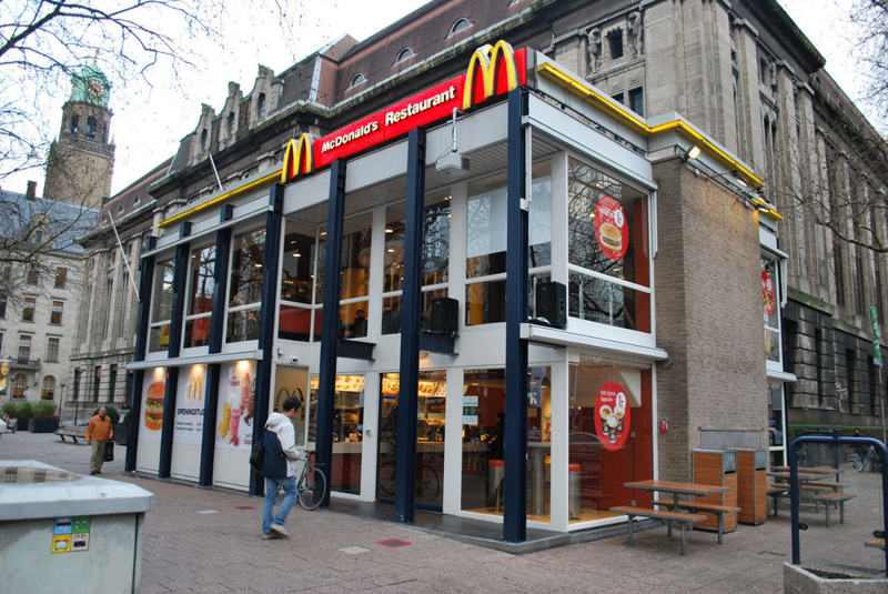 The original building
According to Dezeen, the original glass building, attached to a much older post office, was voted by Rotterdam’s residents as the ugliest structure in the city, and local officials were ready to demolish it. But McDonald’s still had 40 more years on the lease—the redesign route was taken instead.
"Since the 1970s the McDonald's pavilion has been altered frequently. Its quality suffered as a result, with its mostly closed facades. This makes the space anonymous. We want to activate this space again," the design studio’s founder, Robert Winkel, told Dezeen.
The resulting structure is a rectangular glass building with a perforated golden façade, and sleek, white grand spiral staircase. Etched to the façade is pixelated imagery of a crowd, responding to the restaurant’s bustling site. The new building was also detached from the post-office, making it seem more like a pavilion.
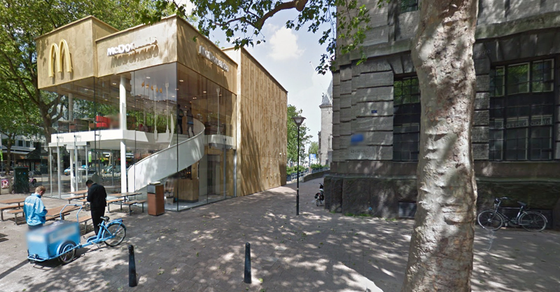 The building is now separated from the much older post office edifice, making the restaurant more like a pavilion. The golden perforated panels depict a pixelated image of a crowd.
Transparency was a key concept in the design. The color-to-ceiling window idea from the original building was kept.
"The transparency and openness, as well as the depicted crowd on the facade panels, emphasize that McDonald's is for everyone, for every Rotterdam resident," Mei Architects' Marloes Koster tells AdFreak.
Onlookers can glimpse into the kitchen as well as get a hint of the grand staircase. By day it reflects sunlight, and the building maintains its glow when sun falls.
"As McDonald's is open day and night, 24/7, its appearance after dark is important," the team told Dezeen. "By day the building is inviting to shoppers, while in the evening it glows to attract the nightlife crowd."
AdWeek reports that the building won an Iconic Award 2015 prize for excellence in architecture and design.
Related Stories
Retail Centers | Nov 13, 2019
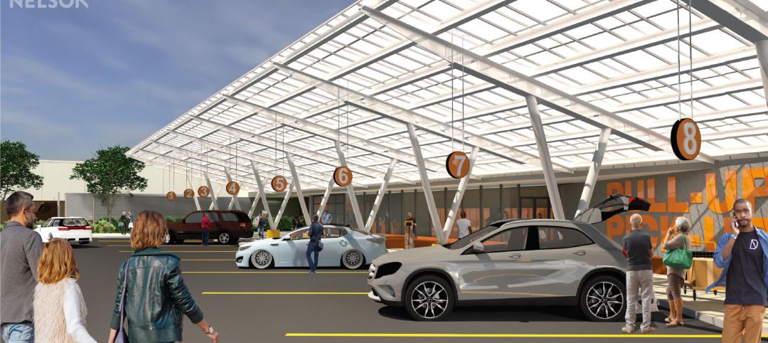
World’s first drive-thru only restaurant in Australia
FRCH NELSON designed the project.
Giants 400 | Oct 24, 2019
Top 70 Retail Engineering Firms for 2019
Jacobs, Kimley-Horn, Henderson Engineers, and Core States Group head the rankings of the nation's largest retail sector engineering and engineering architecture (EA) firms, as reported in Building Design+Construction's 2019 Giants 300 Report.
Giants 400 | Oct 24, 2019
Top 125 Retail Architecture Firms for 2019
CallisonRTKL, Gensler, MG2, NELSON, and Stantec top the rankings of the nation's largest retail sector architecture and architecture engineering (AE) firms, as reported in Building Design+Construction's 2019 Giants 300 Report.
Healthcare Facilities | Oct 1, 2019
Medical offices are filling space vacated by retail
Healthcare developers and providers like the locations, traffic, and parking these spaces offer.
Retail Centers | Sep 6, 2019
Another well-known retailer files for bankruptcy: Here's the solution to more empty anchor stores
Where can you find the future of retail? At the intersection of experience and instant gratification.
Retail Centers | Sep 3, 2019
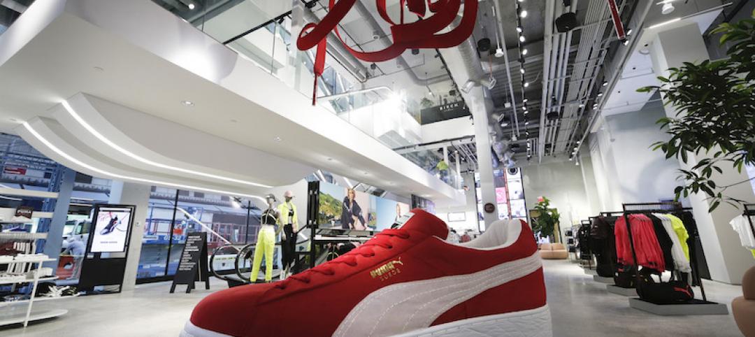
Puma’s flagship in North America creates immersive experiences for its sports-focused patrons
Technology and curation allow customers to personalize their product selections.
Retail Centers | Aug 6, 2019
Saving the American mall in 5 steps
CallisonRTKL Vice President Marc Fairbrother explains how struggling American malls can turn it all around.
Retail Centers | Jun 21, 2019
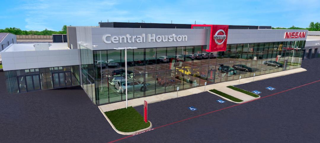
Nation’s largest Nissan facility opens in Houston
A 162,500 SF dealership building set on 16 acres, Central Houston Nissan, in Texas, is being touted as the largest Nissan dealership in the country.
Reconstruction & Renovation | May 22, 2019
Foster + Partners converts historic D.C. library into an Apple store
The building was the city’s first public library.
Retail Centers | Apr 30, 2019
Is this the future of retail? Walmart seems to think so
The retail company recently unveiled its new AI-enabled store in Levittown, N.Y.


