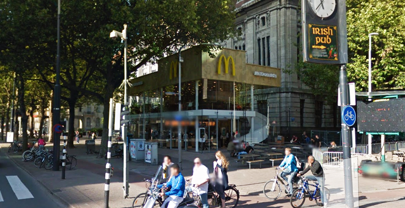
Since the 1960s, residents of the Dutch city of Rotterdam have been bugged by an unsightly cigar shop on Coolsingel, one of its busiest streets.
Years passed, and the eyesore welcomed a new tenant, the U.S.-based fast food chain McDonald’s.
For 45 years, the branch continued to operate in the dated building until finally it received a much needed facelift earlier this year, designed by Mei Architects.
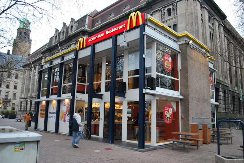 The original building
According to Dezeen, the original glass building, attached to a much older post office, was voted by Rotterdam’s residents as the ugliest structure in the city, and local officials were ready to demolish it. But McDonald’s still had 40 more years on the lease—the redesign route was taken instead.
"Since the 1970s the McDonald's pavilion has been altered frequently. Its quality suffered as a result, with its mostly closed facades. This makes the space anonymous. We want to activate this space again," the design studio’s founder, Robert Winkel, told Dezeen.
The resulting structure is a rectangular glass building with a perforated golden façade, and sleek, white grand spiral staircase. Etched to the façade is pixelated imagery of a crowd, responding to the restaurant’s bustling site. The new building was also detached from the post-office, making it seem more like a pavilion.
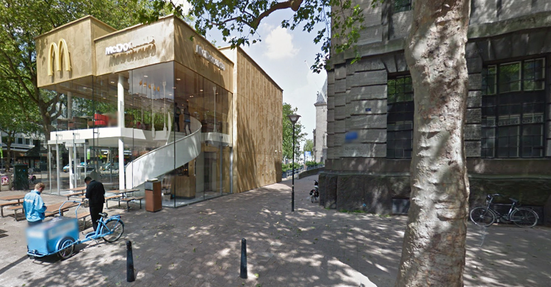 The building is now separated from the much older post office edifice, making the restaurant more like a pavilion. The golden perforated panels depict a pixelated image of a crowd.
Transparency was a key concept in the design. The color-to-ceiling window idea from the original building was kept.
"The transparency and openness, as well as the depicted crowd on the facade panels, emphasize that McDonald's is for everyone, for every Rotterdam resident," Mei Architects' Marloes Koster tells AdFreak.
Onlookers can glimpse into the kitchen as well as get a hint of the grand staircase. By day it reflects sunlight, and the building maintains its glow when sun falls.
"As McDonald's is open day and night, 24/7, its appearance after dark is important," the team told Dezeen. "By day the building is inviting to shoppers, while in the evening it glows to attract the nightlife crowd."
AdWeek reports that the building won an Iconic Award 2015 prize for excellence in architecture and design.
Related Stories
Retail Centers | Apr 2, 2019
Brick-and-mortar retail is not dead—here’s proof
We continually hear that “retail is dying,” but there are many foundational retail types essential to consumers—here’s a look at 3 of them.
Retail Centers | Mar 19, 2019
Porsche’s next-gen showroom prototype opens in Palm Springs, Ca.
The dealership is the first to showcase Porsche’s new design philosophy, ‘Destination Porsche.’
Retail Centers | Dec 3, 2018
Biotrack your shop
Sabrina Hilfer, a specialty retail designer, talks about the integration of biometrics in the retailscape.
Retail Centers | Nov 8, 2018
The Container Store moves into the next generation courtesy FRCH Design Worldwide
The next-gen prototype is located in Dallas, Texas.
Retail Centers | Oct 22, 2018
Stuck in the middle: What can save the average American mall?
Erich Dohrer doesn’t want to talk about the “dead mall” or the great mall success story—he wants to talk about design solutions for the ones that are just getting by.
Retail Centers | Oct 9, 2018
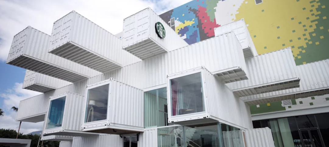
Kengo Kuma designs Taipei Starbucks from 29 shipping containers
The store will be part of a new shopping mall.
Retail Centers | Sep 27, 2018
Turkish bazaar takes the shape of the surrounding mountains
The project is designed by PDG Architects and ANTEPE.
Retail Centers | Sep 26, 2018
The future of travel retail
Kevin Horn and Shirley Cheng explore how a new generation of travelers is disrupting airport retail.
Retail Centers | Sep 20, 2018
BIG designs ‘restaurant village’ just outside of Copenhagen
The restaurant comprises 11 spaces, each with their own unique function.
Retail Centers | Sep 17, 2018
Iteration vs disruption: Designing for a great customer experience
One way to solve for the future is to disrupt the expected.


