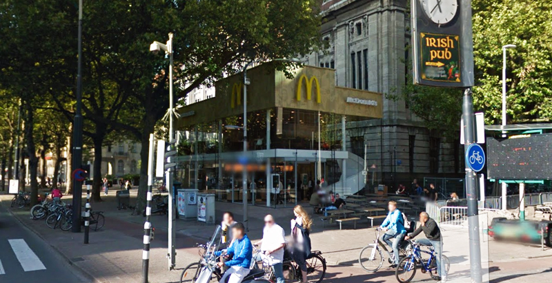
Since the 1960s, residents of the Dutch city of Rotterdam have been bugged by an unsightly cigar shop on Coolsingel, one of its busiest streets.
Years passed, and the eyesore welcomed a new tenant, the U.S.-based fast food chain McDonald’s.
For 45 years, the branch continued to operate in the dated building until finally it received a much needed facelift earlier this year, designed by Mei Architects.
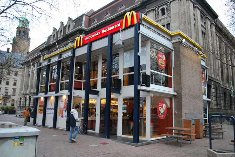 The original building
According to Dezeen, the original glass building, attached to a much older post office, was voted by Rotterdam’s residents as the ugliest structure in the city, and local officials were ready to demolish it. But McDonald’s still had 40 more years on the lease—the redesign route was taken instead.
"Since the 1970s the McDonald's pavilion has been altered frequently. Its quality suffered as a result, with its mostly closed facades. This makes the space anonymous. We want to activate this space again," the design studio’s founder, Robert Winkel, told Dezeen.
The resulting structure is a rectangular glass building with a perforated golden façade, and sleek, white grand spiral staircase. Etched to the façade is pixelated imagery of a crowd, responding to the restaurant’s bustling site. The new building was also detached from the post-office, making it seem more like a pavilion.
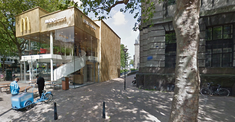 The building is now separated from the much older post office edifice, making the restaurant more like a pavilion. The golden perforated panels depict a pixelated image of a crowd.
Transparency was a key concept in the design. The color-to-ceiling window idea from the original building was kept.
"The transparency and openness, as well as the depicted crowd on the facade panels, emphasize that McDonald's is for everyone, for every Rotterdam resident," Mei Architects' Marloes Koster tells AdFreak.
Onlookers can glimpse into the kitchen as well as get a hint of the grand staircase. By day it reflects sunlight, and the building maintains its glow when sun falls.
"As McDonald's is open day and night, 24/7, its appearance after dark is important," the team told Dezeen. "By day the building is inviting to shoppers, while in the evening it glows to attract the nightlife crowd."
AdWeek reports that the building won an Iconic Award 2015 prize for excellence in architecture and design.
Related Stories
Retail Centers | Nov 20, 2017
28,000-sf brewery and restaurant coming to Houston’s Arts District
Method Architecture designed the three-story building.
Shopping Centers | Nov 15, 2017
900 North Michigan Shops renovation includes 190-foot-long digital art installation on the ceiling
The installation is visible from all floors and built in 10 different sections.
Retail Centers | Nov 13, 2017
American Girl Place New York opens new 37,000-sf New York Store designed by FRCH Design Worldwide
The store is located at 75 Rockefeller Plaza.
Retail Centers | Oct 25, 2017
‘Under’ will be Europe’s first underwater restaurant
The Snøhetta-designed restaurant will also function as a research center for marine life.
Retail Centers | Sep 26, 2017
DATÜM: Reinventing the department store
Department stores are going through a period of transformation in the face of a rapidly changing retail market. What’s behind the change and where is it leading us?
Mixed-Use | Sep 22, 2017
Defending against the online dragon
Some entertainment districts are going light on retail, partly because “the bulk of the leasing demand is for dining and entertainment,” say Barry Hand, a Principal with design mega-firm Gensler in Dallas.
Mixed-Use | Sep 18, 2017
Urban heartbeat: Entertainment districts are rejuvenating cities and spurring economic growth
Entertainment districts are being planned or are popping up all over the country.
Sponsored | Products and Materials | Sep 15, 2017
Creating a movement: How Mamava, Konrad Prefab and ALPOLIC partnered to change the culture of breastfeeding
Since its conception in 2006, the Mamava lactation pod has undergone several changes in design.
Mixed-Use | Sep 14, 2017
Capital One eschews the traditional bank with the Capital One Café
The new branch in downtown Santa Monica offers 8,400 sf of space designed by Gwynne Pugh Urban Studio.
Giants 400 | Sep 13, 2017
Top 75 retail construction firms
The Whiting-Turner Contracting Co., PCL Construction Enterprises, and Shawmut Design and Construction top BD+C’s ranking of the nation’s largest retail sector contractor and construction management firms, as reported in the 2017 Giants 300 Report.


