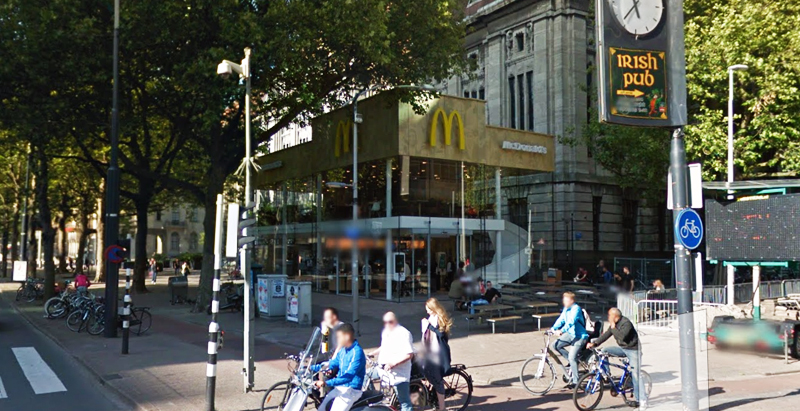
Since the 1960s, residents of the Dutch city of Rotterdam have been bugged by an unsightly cigar shop on Coolsingel, one of its busiest streets.
Years passed, and the eyesore welcomed a new tenant, the U.S.-based fast food chain McDonald’s.
For 45 years, the branch continued to operate in the dated building until finally it received a much needed facelift earlier this year, designed by Mei Architects.
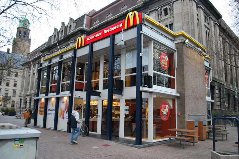 The original building
According to Dezeen, the original glass building, attached to a much older post office, was voted by Rotterdam’s residents as the ugliest structure in the city, and local officials were ready to demolish it. But McDonald’s still had 40 more years on the lease—the redesign route was taken instead.
"Since the 1970s the McDonald's pavilion has been altered frequently. Its quality suffered as a result, with its mostly closed facades. This makes the space anonymous. We want to activate this space again," the design studio’s founder, Robert Winkel, told Dezeen.
The resulting structure is a rectangular glass building with a perforated golden façade, and sleek, white grand spiral staircase. Etched to the façade is pixelated imagery of a crowd, responding to the restaurant’s bustling site. The new building was also detached from the post-office, making it seem more like a pavilion.
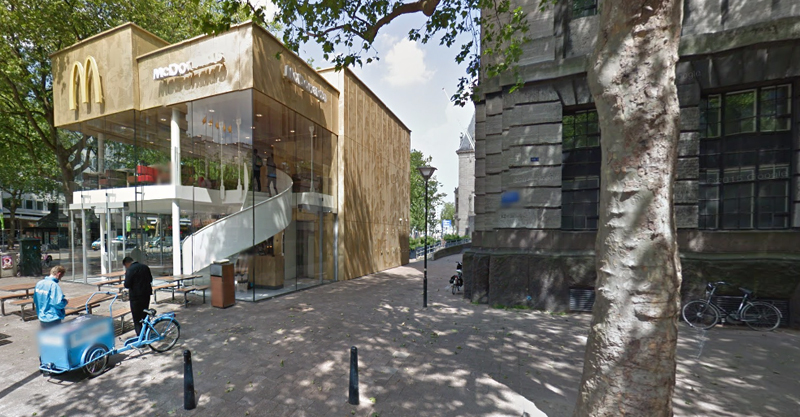 The building is now separated from the much older post office edifice, making the restaurant more like a pavilion. The golden perforated panels depict a pixelated image of a crowd.
Transparency was a key concept in the design. The color-to-ceiling window idea from the original building was kept.
"The transparency and openness, as well as the depicted crowd on the facade panels, emphasize that McDonald's is for everyone, for every Rotterdam resident," Mei Architects' Marloes Koster tells AdFreak.
Onlookers can glimpse into the kitchen as well as get a hint of the grand staircase. By day it reflects sunlight, and the building maintains its glow when sun falls.
"As McDonald's is open day and night, 24/7, its appearance after dark is important," the team told Dezeen. "By day the building is inviting to shoppers, while in the evening it glows to attract the nightlife crowd."
AdWeek reports that the building won an Iconic Award 2015 prize for excellence in architecture and design.
Related Stories
Adaptive Reuse | Nov 7, 2016
From fuel to food: adaptive reuse converts a closed gas station in Princeton, N.J., to a Nomad pizza
The original building dates back to the Modernist 1930s.
Hotel Facilities | Sep 26, 2016
$75 million commercial tower and hotel proposed in downtown Atlanta
The tower would be built on a site currently occupied by a Hertz Car Rental and parking lot.
| Aug 11, 2016
RETAIL GIANTS: Retailers and developers mix it up to stay relevant with shoppers
Retail is becoming closely aligned with entertainment, and malls that can be repositioned as lifestyle centers will have enhanced value.
| Aug 10, 2016
Top 50 Retail Engineering Firms
Jacobs, Henderson Engineers, and WSP | Parsons Brinckerhoff top Building Design+Construction’s annual ranking of the nation’s largest retail sector engineering and E/A firms, as reported in the 2016 Giants 300 Report.
| Aug 10, 2016
Top 80 Retail Construction Firms
VCC, PCL Construction Enterprises, and The Whiting-Turner Contracting Co. top Building Design+Construction’s annual ranking of the nation’s largest retail sector construction and construction management firms, as reported in the 2016 Giants 300 Report.
| Aug 10, 2016
Top 90 Retail Architecture Firms
Gensler, GreenbergFarrow, and MG2 top Building Design+Construction’s annual ranking of the nation’s largest retail sector architecture and A/E firms, as reported in the 2016 Giants 300 Report.
Modular Building | Jul 22, 2016
PNC Bank’s 'Tiny Branch' opens on West Virginia University campus
The new branch doesn’t need much space for its ATM and new accounts and personal loans services.
Retail Centers | Jul 21, 2016
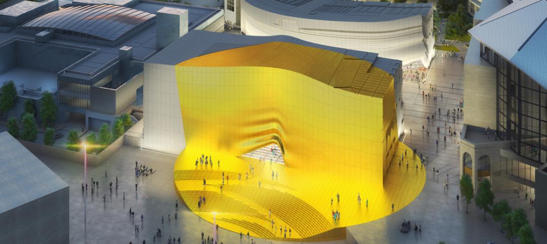
MVRDV designs Seoul entertainment district with gold entrance and curtain façade
The 9,800-sm complex will have retail and nightclub space. A plaza separates the two concrete buildings.
Retail Centers | Jul 14, 2016
Capital One adds coffee shops to bank locations
Several cities opened or are planning Capital One Cafes where customers can buy a latte and make a checking deposit.
Healthcare Facilities | Jun 19, 2016
Rapid growth of retail health clinics presents new choices for consumers, payers, and providers
Service expansions help dealers boost clinics’ profitability.


