Since the 1960s, residents of the Dutch city of Rotterdam have been bugged by an unsightly cigar shop on Coolsingel, one of its busiest streets.
Years passed, and the eyesore welcomed a new tenant, the U.S.-based fast food chain McDonald’s.
For 45 years, the branch continued to operate in the dated building until finally it received a much needed facelift earlier this year, designed by Mei Architects.
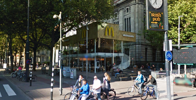
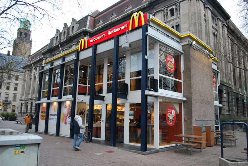 The original building
According to Dezeen, the original glass building, attached to a much older post office, was voted by Rotterdam’s residents as the ugliest structure in the city, and local officials were ready to demolish it. But McDonald’s still had 40 more years on the lease—the redesign route was taken instead.
"Since the 1970s the McDonald's pavilion has been altered frequently. Its quality suffered as a result, with its mostly closed facades. This makes the space anonymous. We want to activate this space again," the design studio’s founder, Robert Winkel, told Dezeen.
The resulting structure is a rectangular glass building with a perforated golden façade, and sleek, white grand spiral staircase. Etched to the façade is pixelated imagery of a crowd, responding to the restaurant’s bustling site. The new building was also detached from the post-office, making it seem more like a pavilion.
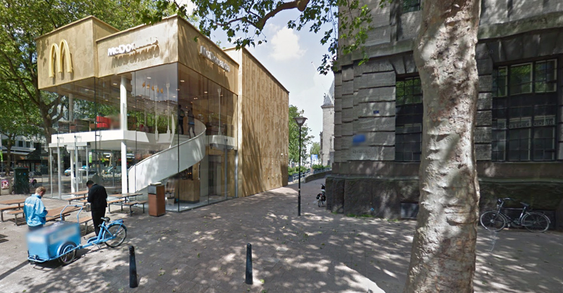 The building is now separated from the much older post office edifice, making the restaurant more like a pavilion. The golden perforated panels depict a pixelated image of a crowd.
Transparency was a key concept in the design. The color-to-ceiling window idea from the original building was kept.
"The transparency and openness, as well as the depicted crowd on the facade panels, emphasize that McDonald's is for everyone, for every Rotterdam resident," Mei Architects' Marloes Koster tells AdFreak.
Onlookers can glimpse into the kitchen as well as get a hint of the grand staircase. By day it reflects sunlight, and the building maintains its glow when sun falls.
"As McDonald's is open day and night, 24/7, its appearance after dark is important," the team told Dezeen. "By day the building is inviting to shoppers, while in the evening it glows to attract the nightlife crowd."
AdWeek reports that the building won an Iconic Award 2015 prize for excellence in architecture and design.
Related Stories
Market Data | Feb 26, 2016
JLL upbeat about construction through 2016
Its latest report cautions about ongoing cost increases related to finding skilled laborers.
Industry Research | Feb 22, 2016
8 of the most interesting trends from Gensler’s Design Forecast 2016
Technology is running wild in Gensler’s 2016 forecast, as things like virtual reality, "smart" buildings and products, and fully connected online and offline worlds are making their presence felt throughout many of the future's top trends.
Market Data | Feb 10, 2016
Nonresidential building starts and spending should see solid gains in 2016: Gilbane report
But finding skilled workers continues to be a problem and could inflate a project's costs.
Market Data | Feb 9, 2016
Cushman & Wakefield is bullish on U.S. economy and its property markets
Sees positive signs for construction and investment growth in warehouses, offices, and retail
Market Data | Jan 20, 2016
Nonresidential building starts sag in 2015
CDM Research finds only a few positive signs among the leading sectors.
| Jan 14, 2016
How to succeed with EIFS: exterior insulation and finish systems
This AIA CES Discovery course discusses the six elements of an EIFS wall assembly; common EIFS failures and how to prevent them; and EIFS and sustainability.
Retail Centers | Dec 13, 2015
Aged chimney in Baku sees new life as shopping center totem
For the Twin Towers of Port Baku, the restoration requires an elaborate anchoring and stabilization process.
Retail Centers | Nov 18, 2015
Foster + Partners unveils design for Apple Store on Chicago River
The 20,000-sf store draws inspiration from the Prairie School architectural style.
Shopping Centers | Nov 12, 2015
Dallas Cowboys owner Jerry Jones breaks ground on $1 billion mixed-use development
The plan calls for retail space, including a Walmart, along with offices, apartments, and homes.
Multifamily Housing | Oct 7, 2015
BIG designs lush, terraced mixed-use building in Sweden
Cascading glass and wooden cubes create a form similar to Northern Ireland’s Giant’s Causeway rock formation.


