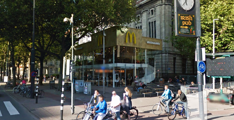
Since the 1960s, residents of the Dutch city of Rotterdam have been bugged by an unsightly cigar shop on Coolsingel, one of its busiest streets.
Years passed, and the eyesore welcomed a new tenant, the U.S.-based fast food chain McDonald’s.
For 45 years, the branch continued to operate in the dated building until finally it received a much needed facelift earlier this year, designed by Mei Architects.
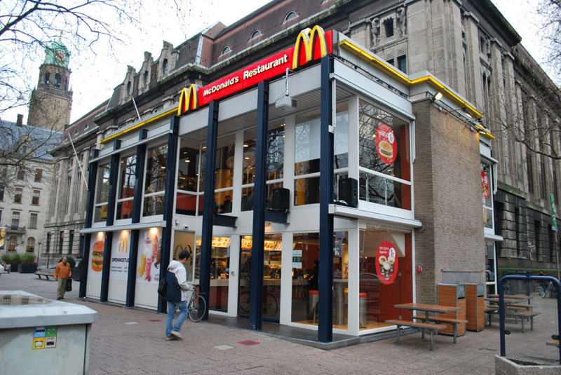 The original building
According to Dezeen, the original glass building, attached to a much older post office, was voted by Rotterdam’s residents as the ugliest structure in the city, and local officials were ready to demolish it. But McDonald’s still had 40 more years on the lease—the redesign route was taken instead.
"Since the 1970s the McDonald's pavilion has been altered frequently. Its quality suffered as a result, with its mostly closed facades. This makes the space anonymous. We want to activate this space again," the design studio’s founder, Robert Winkel, told Dezeen.
The resulting structure is a rectangular glass building with a perforated golden façade, and sleek, white grand spiral staircase. Etched to the façade is pixelated imagery of a crowd, responding to the restaurant’s bustling site. The new building was also detached from the post-office, making it seem more like a pavilion.
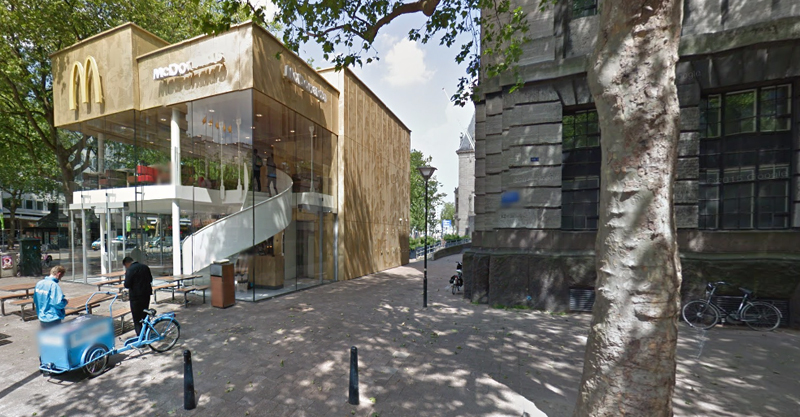 The building is now separated from the much older post office edifice, making the restaurant more like a pavilion. The golden perforated panels depict a pixelated image of a crowd.
Transparency was a key concept in the design. The color-to-ceiling window idea from the original building was kept.
"The transparency and openness, as well as the depicted crowd on the facade panels, emphasize that McDonald's is for everyone, for every Rotterdam resident," Mei Architects' Marloes Koster tells AdFreak.
Onlookers can glimpse into the kitchen as well as get a hint of the grand staircase. By day it reflects sunlight, and the building maintains its glow when sun falls.
"As McDonald's is open day and night, 24/7, its appearance after dark is important," the team told Dezeen. "By day the building is inviting to shoppers, while in the evening it glows to attract the nightlife crowd."
AdWeek reports that the building won an Iconic Award 2015 prize for excellence in architecture and design.
Related Stories
Retail Centers | Jul 17, 2017
Subway updates restaurants, brand with fresh design and improved customer experience
FRCH Design Worldwide is leading the redesign that will start with 12 pilot locations across the country.
Retail Centers | Jul 10, 2017
The retail renaissance part II: The role of planning and development in the future of shopping
The retail sector is charting unfamiliar territory as web sales and evolving tastes force a paradigm shift.
Retail Centers | Jun 21, 2017
Creating communities from defunct malls
It’s time to plan for the suburban retail reset—and it starts by rethinking the traditional mall.
Mixed-Use | May 17, 2017
The Lincoln Common development has begun construction in Chicago’s Lincoln Park
The mixed-use project will provide new apartments, condos, a senior living facility, and retail space.
Airports | May 15, 2017
Five trends for airport retail
CallisonRTKL Vice President Kevin Horn pinpoints how travel retail is changing dramatically.
Retail Centers | May 3, 2017
18 Carbon fiber wings grace Foster + Partners-designed Apple Dubai Mall terrace
The store’s large terrace provides views of the Burj Khalifa and the Dubai Fountain.
Retail Centers | May 2, 2017
43,000-sf Chicago Starbucks will be world’s largest
The new branch will be located along Chicago’s Magnificent Mile in a building currently occupied by a Crate & Barrel store.
Healthcare Facilities | Apr 28, 2017
Can healthcare be retail?
Healthcare systems have much to learn from retail. While they have been laser-focused on delivering exceptional patient care on their primary campuses, they face an onslaught of new challenges as they embrace a retail strategy to expand outpatient services and their ambulatory network.
Retail Centers | Apr 27, 2017
Changing an automotive retail paradigm
Significant changes are underway as automotive manufacturers and retailers try to anticipate consumer demands in changes in their business models.
Mixed-Use | Apr 24, 2017
Take a look at Brooklyn’s Domino Sugar Refinery redevelopment
The master plan features market-rate and affordable housing, mixed-use space, and a waterfront park with a 5-block long “Artifact Walk.”


