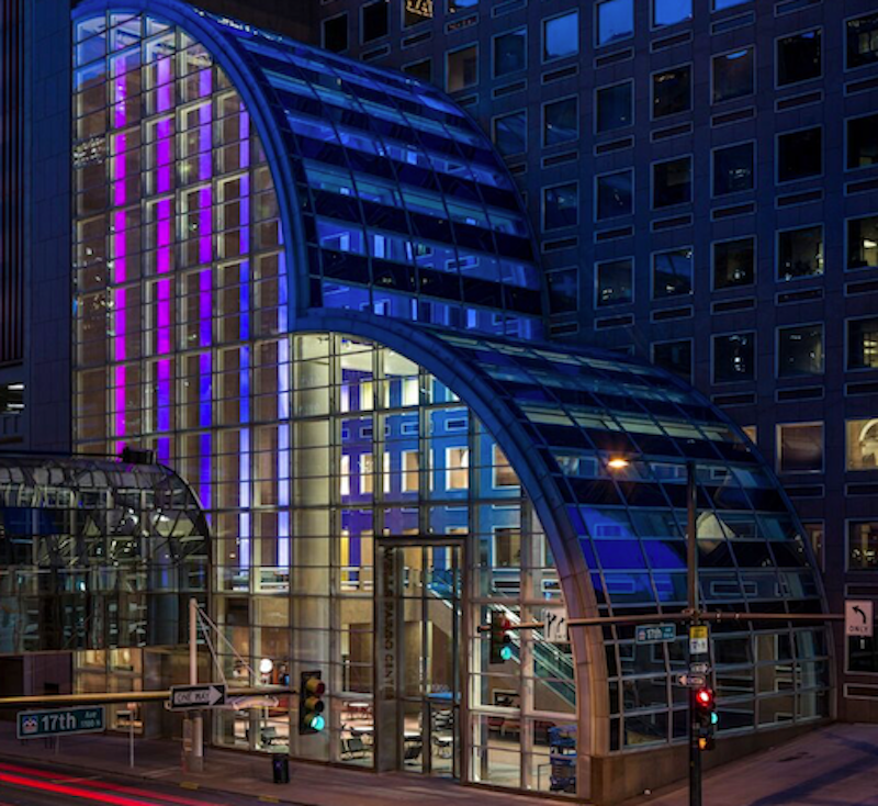
While the entirety of Denver’s Wells Fargo Center may have just completed a three-year renovation process, it is the 86-foot floor-to-ceiling digital installation in the lobby that is getting all the attention. Five thin LED columns with screen resolutions that are six times that of normal HD are bringing life to the previously somber lobby of the building originally designed by Philip Johnson.
The five screens, when viewed together, create one cohesive canvas that alternates between artistic and conceptual images such as colorful swirling ink drops or realistic depictions of the surrounding Colorado landscape. A grove of trees rises 86-feet into the air and slowly sways in the breeze, changing with the time of day and the time of season; a flock of birds, animated in real-time, can fly across the screens for hours and never repeat the same flight pattern; and mountainscapes created from thousands of Instagram photos provide different viewing experiences depending on your proximity to the screens. The installation can serve a practical purpose, as well, such as displaying the five-day weather outlook.
The main goal was for the screens to feel like a giant window to the outside, according to Ed Purver, Senior Immersive Designer at ESI Design. The installation is visible from outside through the glass atrium and is quickly becoming a new tourist attraction in the city of Denver.
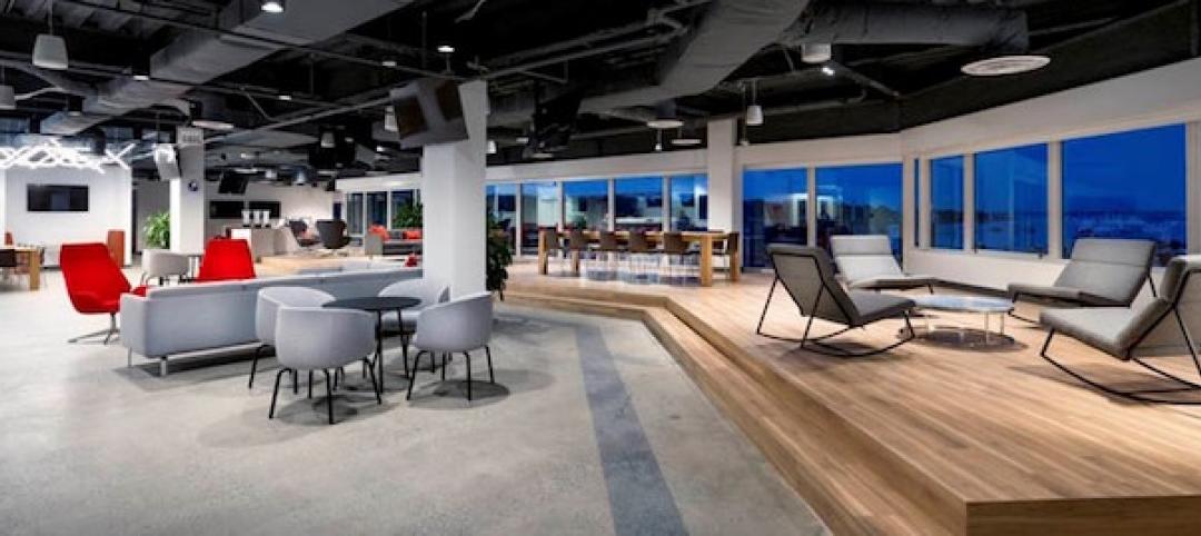
The lobby also underwent changes to make it more modern, social, and comfortable. New works of art, commissioned specifically for the site, furniture, and lighting were added in an effort to keep the original Philip Johnson aesthetic alive while giving the space a more modern feel.
You can view images of the display and a video below.
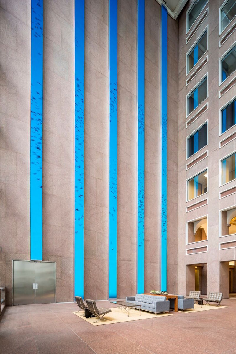 Photo Courtesy of ESI Design
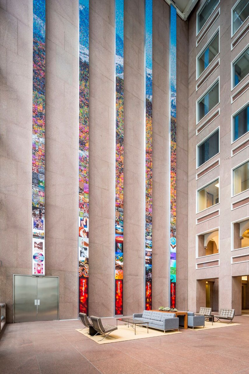 Photo Courtesy of ESI Design
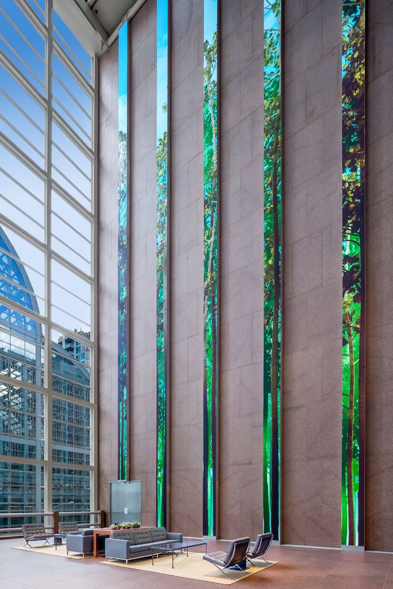 Photo Courtesy of ESI Design
Wells Fargo Center, Denver, by ESI Design from ESI Design on Vimeo.
Related Stories
Office Buildings | May 22, 2018
Where fun follows function: New study reemphasizes the value of play in the workplace
Perkins Eastman recommends personalization, access and “linkages,” and variety as design criteria.
Office Buildings | Apr 25, 2018
Cardiff is home to the new BBC Cymru Wales headquarters
Foster + Partners designed the building.
Office Buildings | Apr 23, 2018
Activity-based design takes precedence in new office projects
The latest report by Ted Moudis Associates also finds more space being allocated for amenities and wellness.
Office Buildings | Apr 19, 2018
From fitness to bowling alleys: How commercial office buildings are differentiating themselves through amenities
Here are five ways that amenities can help developers and building owners attract and secure tenants by appealing to their inhabitants.
Office Buildings | Mar 21, 2018
Yeti’s new global headquarters evokes the outdoors
Gensler designed the new HQ.
Office Buildings | Mar 19, 2018
A cost guide to office fit-outs provides comparisons for 59 markets
The new JLL report also finds landlords offering more generous tenant improvement allowances.
Movers+Shapers | Mar 19, 2018
Movers + Shapers: Tech takeover
From Chicago to Charlotte, the tech boom is transforming urban real estate markets and redefining workplace design.
Office Buildings | Mar 19, 2018
The new office has roots in retail
How retail’s focus on brand authenticity, heritage and education are transforming workplace design.
Office Buildings | Mar 13, 2018
Using workplace data to create connected communities
Workplace data is being put to use by corporate service groups to provide a better employee experience and empower the businesses that are their customers.
Office Buildings | Mar 12, 2018
Sound advice on workplace design
Thoughtful design, paired with a change management program to educate staff, can both enhance connectivity and minimize distractions.


